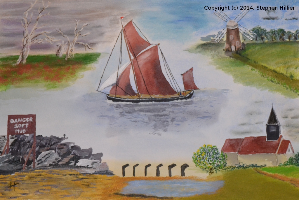
Composite Essex. The first work I have ever done especially for an exhibition. The group were asked to produce work for an exhibition at Bedfords Park, Havering on the theme ‘Essex in Colour’. I spent an evening researching the sort of images I might use to create a composite picture of scenes in Essex, England. Interestingly I found a number of Counties with the name Essex in the USA and Canada. With a range on images downloaded and available (thank you Google) I sketched out on a piece of paper the layout I wanted to use.
I found many images of sailing barges in and around Maldon but very few were side on with the sails unfurled. There are a number of windmills in Essex but the mill at Thaxted is a very prominent tower mill. I planned to include St Nicholas Church, Laindon, a picture I have painted before. What to use in the other corners. The rust coloured sign on the beach at Jaywick just caught my bizarre sense of humour. The Mundon Oaks. I had never come across these before. I found a number of images and in fact I painted a composite made up from two of these images. Finally to add some bright colour I found some beach huts at Leigh.
Please note there are some tonal differences in the pictures due the differing light conditions when the photos were taken.
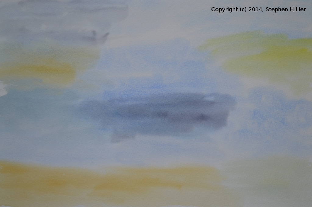
 Having decided early on that I would be using mixed media I needed to get an under painting to layout the picture. To start off the picture I set out a number of water colour washes. Although each image has it’s own sky, water / earth features I wanted the washes to blend into each other so working quite quickly wet into wet I put the washes down
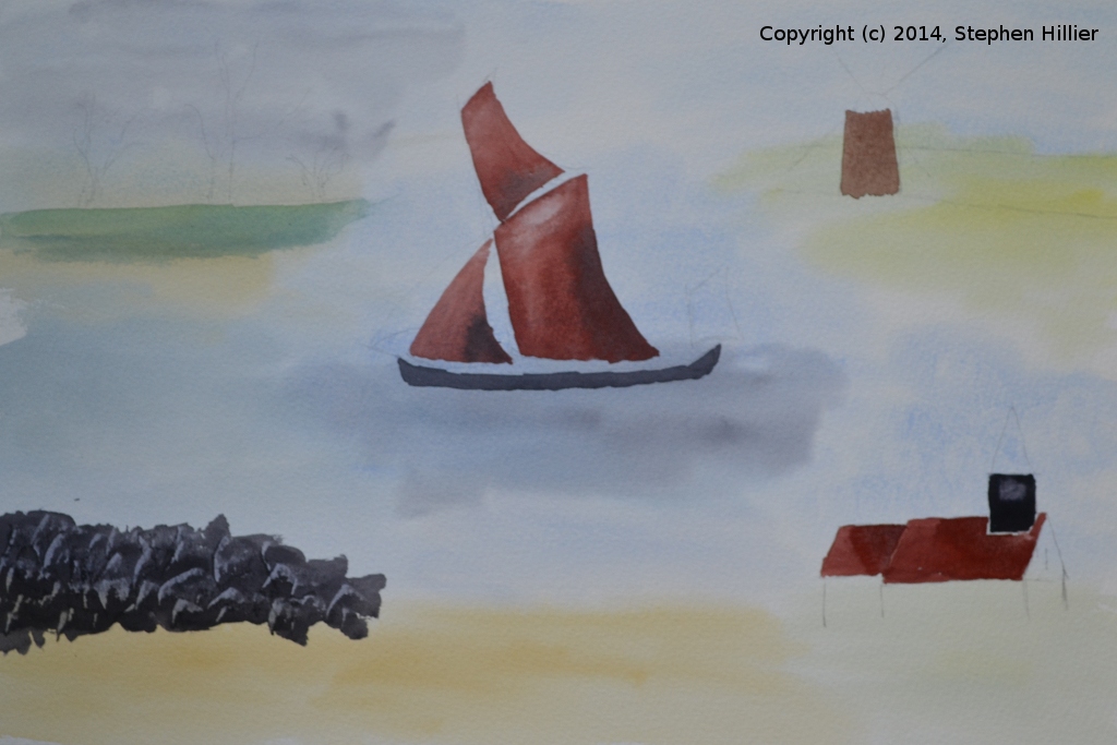
 Next I set out the main blocks of colour using water colour paints. The sails were done using some reds I found in a mixing dish. I added a little neutral tint to get the dark areas and uses paper towel to lift off some paint for the highlights. The rocks bottom left were done by applying a block of neutral tint thickly and then using the edge af a credit cards to draw off some paint. The roof of the church and the tower of the mill were blocked in using the same basic mixing dishes. I used a little white gouache to produce the waves around the barge.
 I added a few final touches of water colour by completing the roof and tower of the church and adding the hedgerow behind the windmill. I also added the rigging to the barge. Then working in soft pastel I worked on the sky for the church, the mill and the oaks. Whilst the oaks and the mill have very different colour skies I needed to blend the pastel where they joined to avoid a hard edge. There is just touch on mauve in the sky for the oaks. To achieve the effect of the poppies I took a small piece of soft red pastel and crumbled it between my fingers above the paper letting the particles fall onto the picture. This pastel was fixed before proceeding.
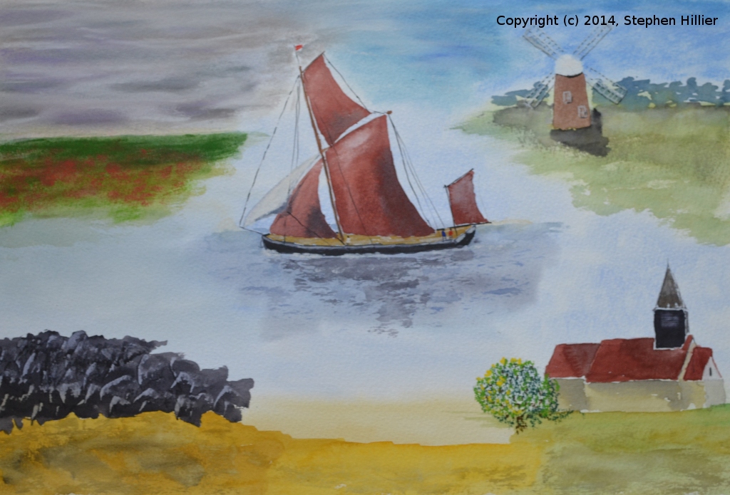
 I now worked on adding the detail to the windmill and the church in soft pastel fixing this as I went. At this stage I was working from memory as I had left my resource material at home. I put the sails of the mill behind the tower by mistake but it does not detract from the final picture. Because I could not get the white sail on the barge to show up I added a little pastel to the sky between the rigging. For some of the detail I used pastel pencils. This pretty much finished the pastel work and it was all fixed.
 I now turned to acrylic paint to add more detail to the rocks in the bottom left and using an acrylic medium to thin the paint I added the sign. I also used a little acrylic to add the dimples in the sand in the foreground. Still trying to make the white sail stand out I applied some white acrylic and I used the same to try to highlight the sails on the windmill. Finally in this session I used some Conte hard pastels to add the oak trees in the top left corner. These trees are actually dead so I used only two or three colours to get the effect.
 Next I used Indian Ink to sketch out the roof line of the beach huts. I also re-worked the rigging on the barge, added some ink at places along the sails of the windmill and a little to the tower of the church. Trying the make the sails of the windmill were probably the most difficult part of this work and juxtaposing the white pastel with the Indian Ink seemed to make it a bit better. The water in front of the beach huts was added in pastel.
 Working towards the final stages now. I used Sennelier oil pastel to block in the colour of the beach huts and used a sharp point to scrape off the pastel to give the idea of the timber finishes of the doors etc. To achieve the reflections I lightly used the oil pastel in the appropriate areas and then using a little bit of Brasso wadding (metal polish) I lightly wiped the wadding across the pastel to smudge and blend in the edges. As final touches to the picture I used some pastel pencils to add the grass features in front of the poppies, the bushes in front of the church and the grass features along the paths of both the church and the windmill.
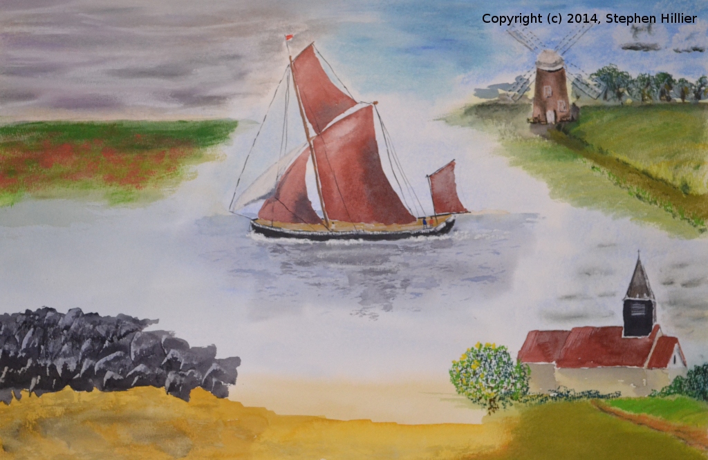

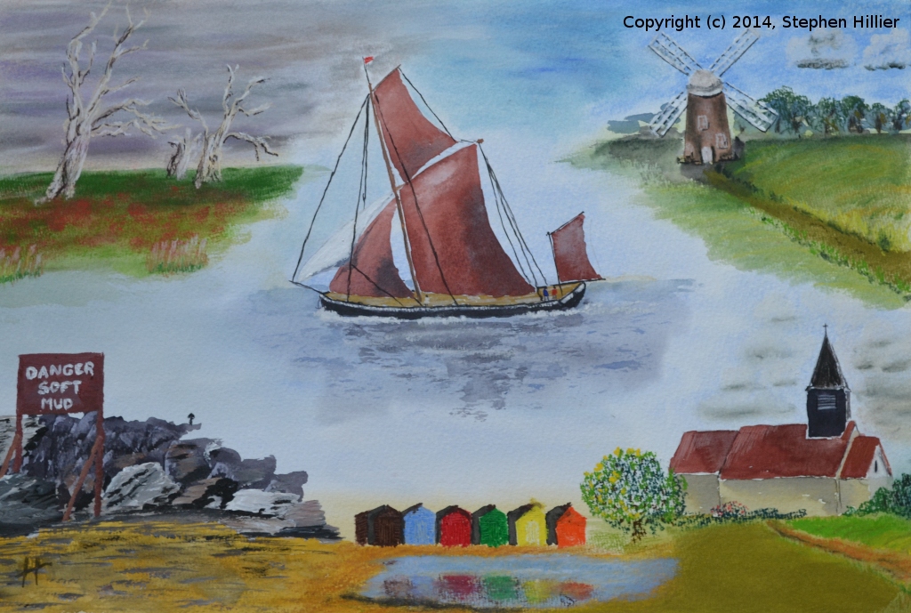
The final analysis. Did I achieve what I set out to do? Yes, probably. I am pleased about the way the barge has turned out, water and boats not being my thing. The oaks have worked far better than I thought they would do when I set out. The windmill has made me consider taking a tour of the windmills in Essex and using them as the subject for a series of pictures. If I were to do this again I think I would place the barge a little further down the page but this did not really appear as an issue until the final stages of the painting. I put this picture up for sale at the Bedfords Park exhibition with a £95 price tag. I thought about applying the minimum wage but it would make it far too costly!!