I have attended a number of tutorials over time and I have decided to put some of my efforts on this page. Note: not everything I have done in these tutorials will ever see the light of day.
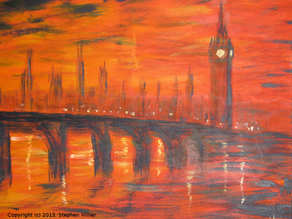
 18 July 2012. This was my first real attempt at acrylic work. In advance of this tutorial I did some other acrylic work which one day will appear elsewhere on this website.
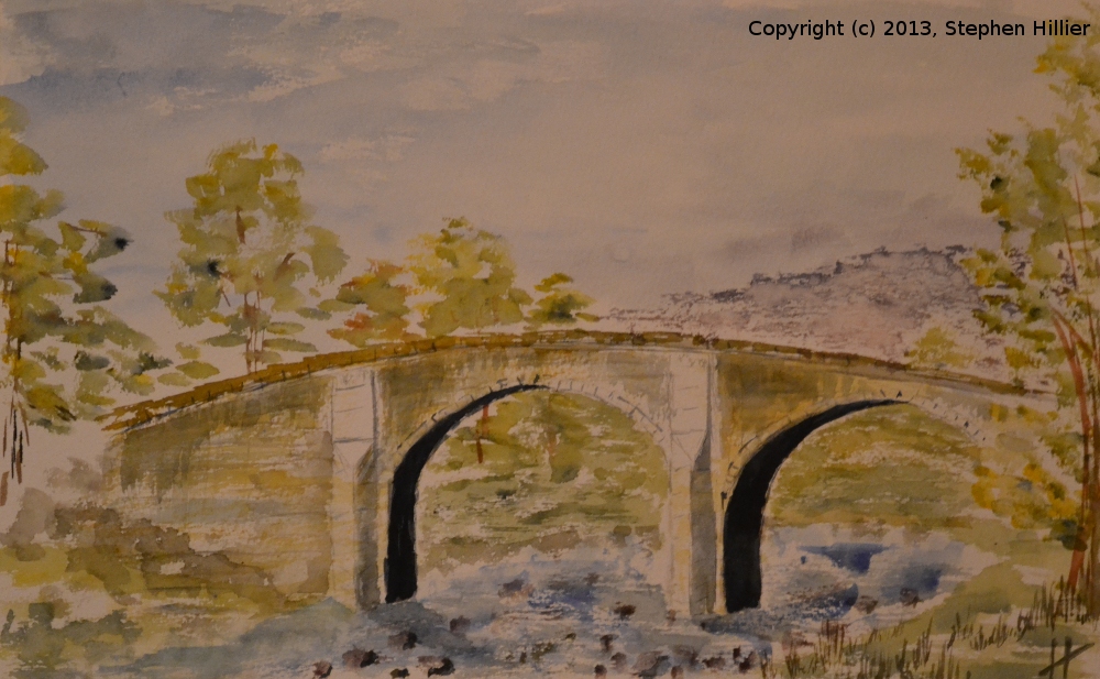
Whilst not set out as a deliberate limited palette this work used Winsor and Newton Galleria acrylic on canvas. The colours used were Vermillion, Prussian Blue, Cadmium Yellow and White (the tutor had suggested Cadmium Red, Ultramarine but being troublesome I used something different). The result, however, is more fiery than using the deeper Cadmium Red. I did a copy of this picture which was sold at auction (price undisclosed). 26th June 2013. An imaginary scene of a Stone Bridge somewhere in Northern England. Painted in a tutorial session (with some touch ups later in the day) where the subject was Yorkshire Dales. Painted in watercolour on 200lb Bockingford 1/2 Imperial.
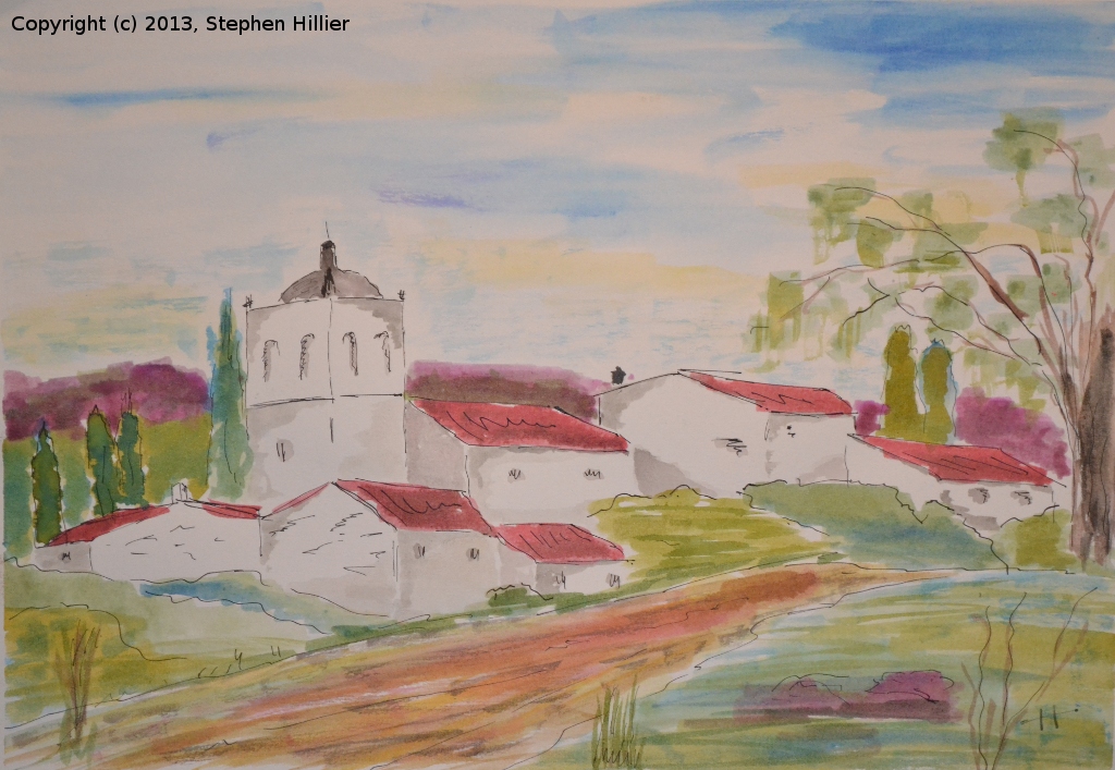
It was this painting that gave me the spur to do a limited palette painting of a bridge which can be seen on my ‘Limited Palette’ page here. 24th April 2013. The tutorial was on painting Bamburgh Castle in acrylic, only I forgot to look at the events list and I didn’t take a canvass nor any acrylic paint. So using what I had, which was a piece of A4 140lb stretched Langton NOT and some Rembrandt watercolour I followed as closely as I could the tutorial. The sky was lucky happenchance. I used Prussian Blue and dabbed some Alizarin Crimson and some Gamboge on with a sponge. Not liking the effect I brushed it off with some tissue. I suppose it sort of works. I could not get the crashing rollers as per the reference so I used a dead calm sea instead, a mixture of Prussian Blue and Indigo. The foreshore is mainly yellow ochre. The castle, as with all my buildings, leans to the right. All the colours were applied with as little water as possible and in some cases straight out of the tube.
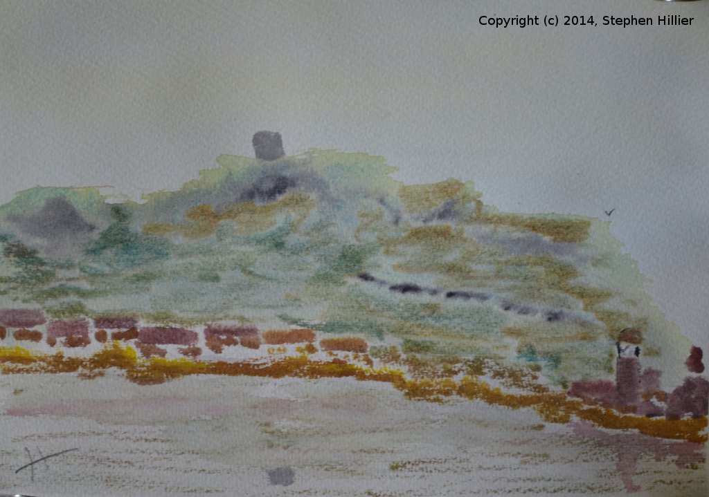
 21st September 2013. This was from a tutorial on complementary colours. I am debating some tidy up of the hills in the background so that they look more like hills than a dark cloud. This work did get an honourable mention by Roger on ‘Mixing Pure Watercolour’ page in the Members’ Area.
 Two pictures from tutorial by Frederick Noakes.
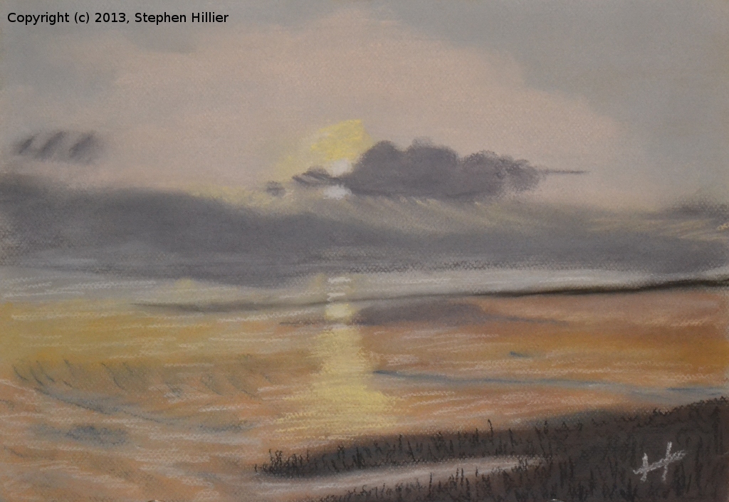
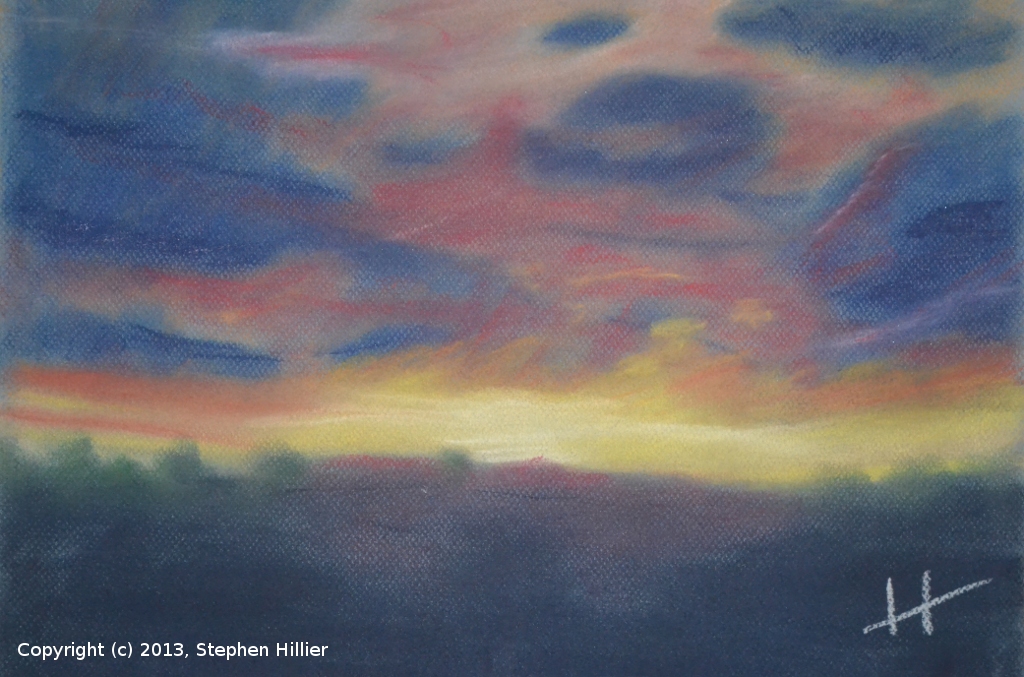
12th December 2012. A tutorial on ‘Skies the Limit’. Two pictures painted from a photograph in soft pastel. They both seem to work reasonably well but the one on the right is a little more dramatic.
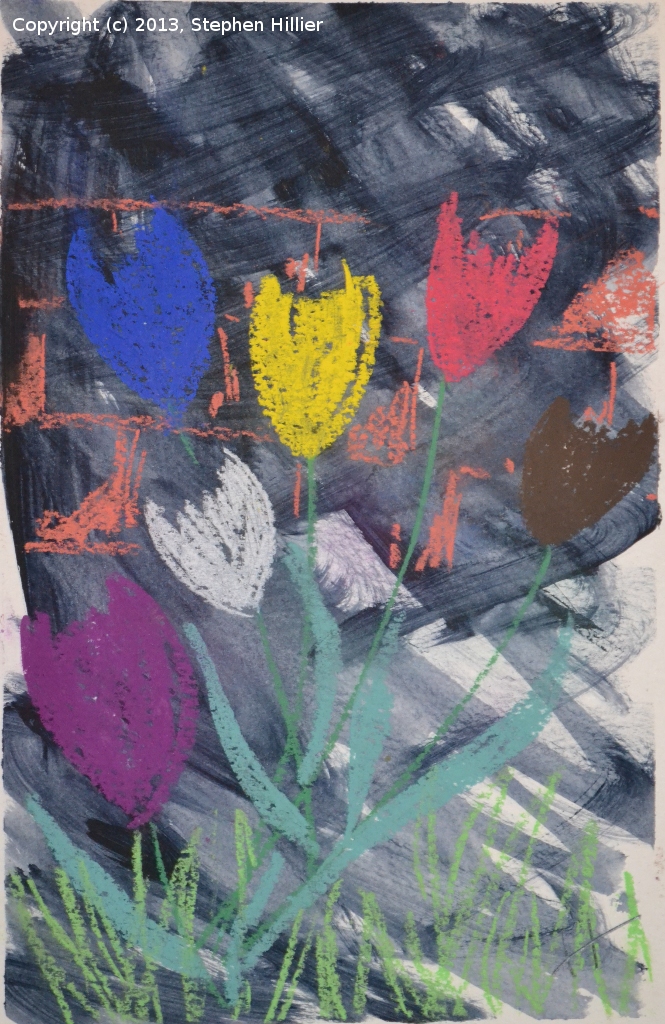
 13th February 2013. Brian Kelleher gave a tutorial on using Oil Pastel. Under his guidance I produced the two pictures on the left. I used Sennelier oil pastel – a starter set of 12 colours. These really are a delight to work with.
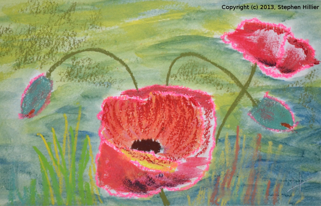
 On the left the third painting from the Brian Kelleher tutorial on oil pastel.
On the right, and I assume from the same tutorial, some poppies in acrylic.
 On the left, 3rd November 2012. John Long gave a tutorial on using Pen and Wash. This painting was done entirely in Winsor and Newton drawing inks on medium cartridge paper.
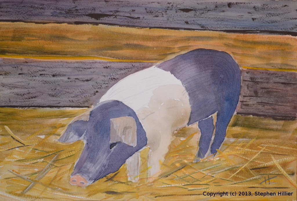
On the right, 17th October 2012. A tutorial on ‘Cats’. On the basis that a cat is only a furry pig with whiskers, here is my effort. Painted in watercolour and gouache on Bockingford Extra Rough 200lb.
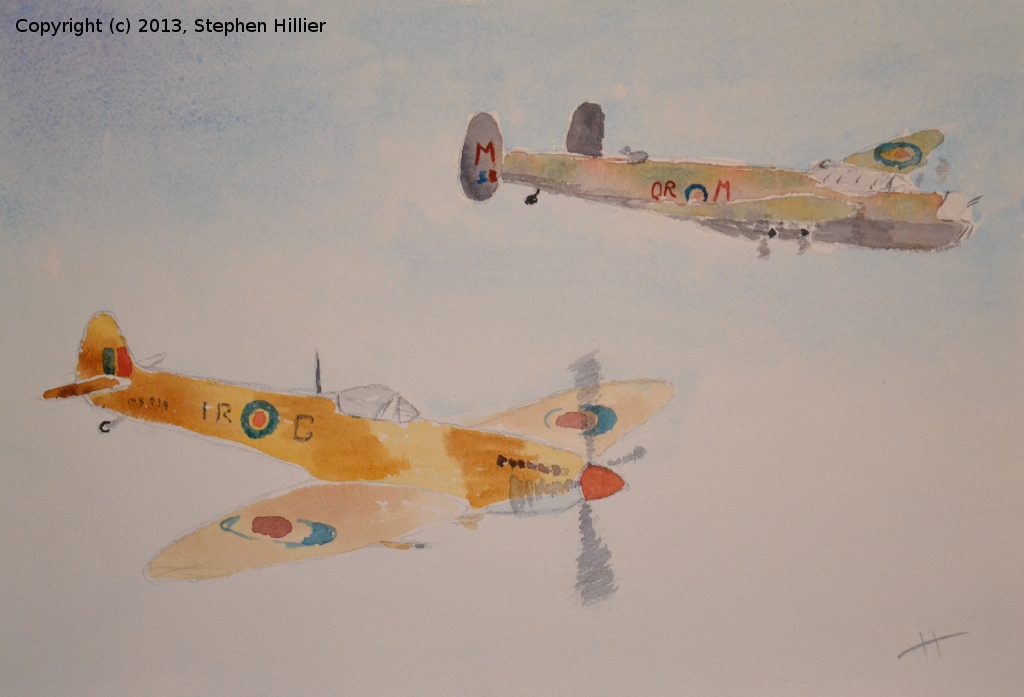
 On the left, 22nd September 2012. Jean Willis gave a tutorial where the theme was the ‘Jubilee celebrations’. Having an aversion to drawing people I searched the internet and came across a picture of the RAF Memorial Flight. Painted in watercolour on Bockingford Extra Rough 200lb.
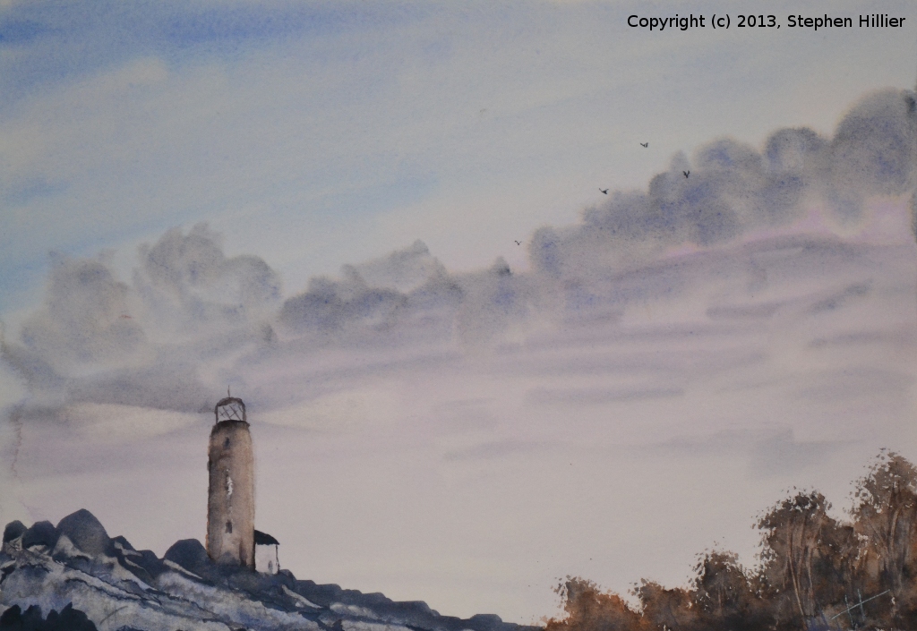
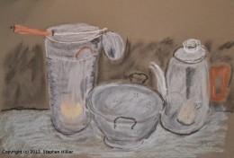
On the right, 28th August 2013. Jean gave us a tutorial on painting metal objects. This was done using Unison soft Pastels (light colours set). On a visit to the SAA exhibition in July 2013 I sat in on a tutorial given by Matthew Palmer. In the space of about 45 minutes a whole class had completed this picture. The rocks on the left were formed by putting a wash on the paper and then using a credit card to form the lights and shadows. The trunks of the trees on the right were formed by running a finger nail across the wash and just moving the paint a little. The rays of the lighthouse were created using some card to create a mask and then re-wetting the paper and lifting off some paint with a sponge.
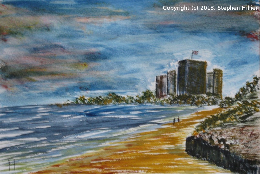
 This tutorial was about painting sunsets and piers on a sea shore setting. the reference used was image of Cromer beach and the work was designed for acrylic or water colour. Using Daler Rowney System 3 process colours I kept in the spirit of the tutorial whilst doing my own thing with Process Colours. I think it is fair to say that this was very different to the work by others of the Group.
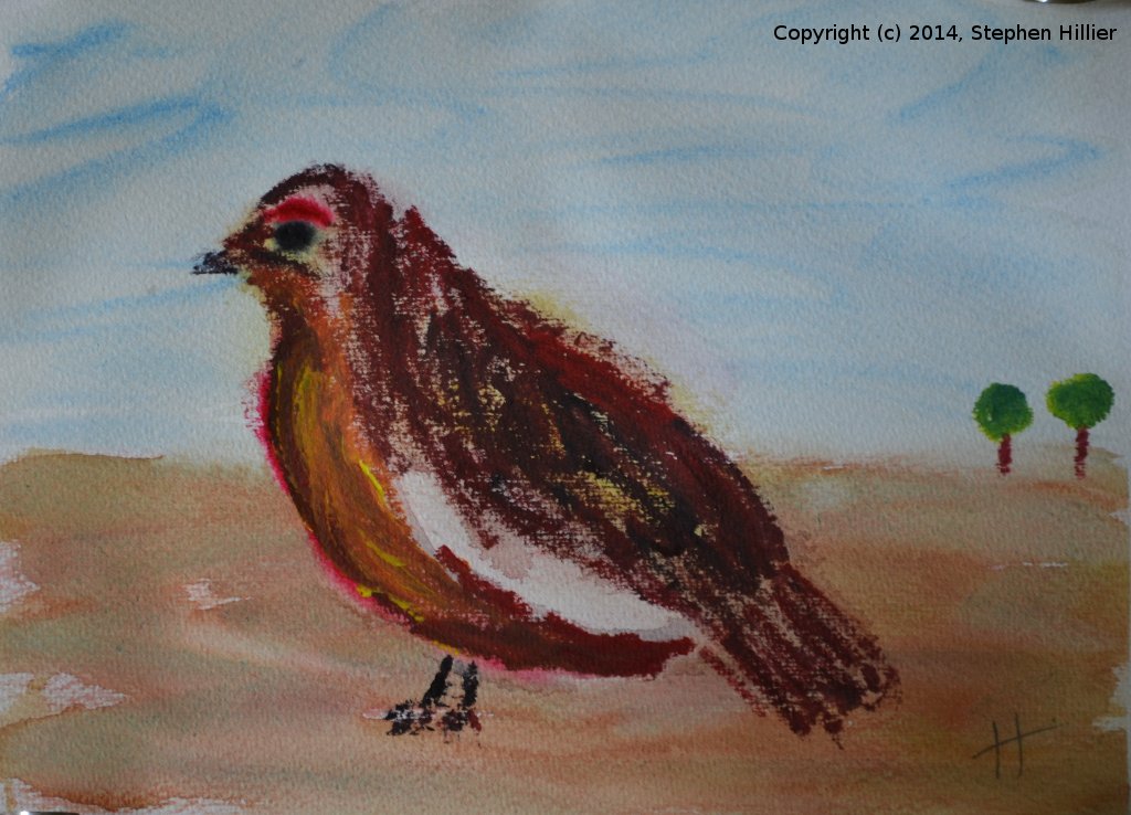
 The Tutorial was ‘painting without a brush’. Both paintings were done using a cmyk watercolour palette – see my process colours page. On the right entitled “Partridge ‘n’ pair tree” was supposed to be a grouse and looks more like a robin!! Mainly cotton buds (Q tips) and sponge. The bird painted with nearly undiluted paint. On the left an image I sketched in 1991 of Maghera in Ireland. Painted rapidly mostly wet on wet. Both paintings were done on Lana Sugar Cane paper. I had not stretched this so there was a lot of ruckles. It seems to me that this paper absorbs more water and ordinary rag supports. I will stretch it before I use it again.
 This was a tutorial on ‘Gardens’. This reference was chosen because it was the one that look least like a garden, appealed to my agricultural background and looked as if it could work in CMYK colours. See other notes on this painting here. It was painting in Daniel Smith Watercolour. It got titled ‘Baa Two’ because it has no sheep baa two. The horns on the sheep are not quite right and I am not sure that the lichen on the dry stone wall is recognisable but I was trying this as an exercise in CMYK watercolour in which I think the range of colours achieved seems to work.