I suppose painting has been in my family for a while. Both my father and his sister painted although neither had large amounts of output.
After a few sketches in 1982/3 I did very little until 1990 when I took lessons from Liz Moon in Cambridge. From then until about 2011 I dipped in and out of paintings but then on joining an Art Group with weekly painting sessions my output soared and the quality improved. I also experimented with new media.
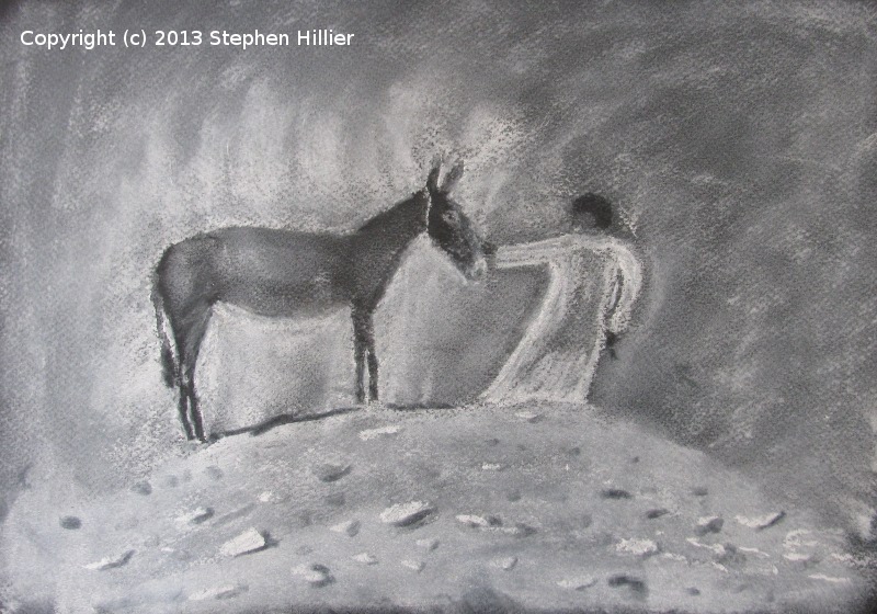
I have used most media with the exception of oil (but I have used water miscible oils). I like watercolour but I don’t think I have produced my best work in this medium. I am best pleased with some of the pastel paintings I have done. I find acrylic too messy not too controllable and definitely unforgiving when used as a replacement for water colour. I have also used tinted charcoal which I like but I dislike the fact that they are in pencil form.
These pages signpost some of my work. As a computer software engineer I am in favour of using open source software and I have tried to follow this principle with the work I have displayed here, letting people know what I used to produce the work and where possible I give some idea of how the work was produced.
Other than that I have tried to break up my pages into subject related sub-pages.
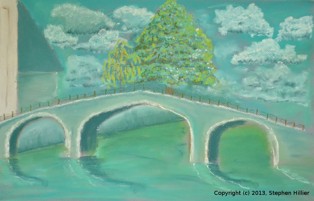
 Bridge at Begijnhof
Anyone who has toured Bruges will probably have come across this bridge.
On a visit way back I did a small pencil sketch and have recently used this to produce the work on this page. Keeping it in the Family
My father did a lot of art as a young man and then later in life. I have a number of his sketches and every now and then I dust one down and have a go at it myself. On this page is a selection of the work I have produced from his sketches. I have augmented this with some work produced by my Grandaughter. Art from Tutorials
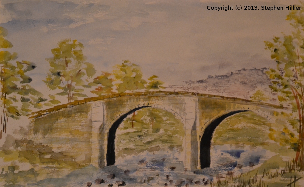
A page dedicated to art that I produced at tutorial sessions at WHAG. To the left is an imaginary scene of a Stone Bridge somewhere in Northern England. Painted in a tutorial session (with some touch ups later in the day) where the subject was Yorkshire Dales. Painted in watercolour on 200lb Bockingford 1/2 Imperial. My world in acrylic
I have only just started getting to grips with acrylic painting. This page contains a few examples not all of them perfect. Painting with a limited palette
I have lately been experimenting with using a limited palette whether this is with watercolour or pastel.
By limited palette I mean painting with a single colour or using a palette derived from two of the three primaries.
To the left is a painting made by using ONLY Indigo and Gamboge. Nile scenes
In 1993 I took a trip along the Nile and was snapping a lot of pictures. This image drew my attention and I took a snap on Ilford black and white film which I later developed and printed myself. Visit this page to see some of the other work I have done from this 7 day trip. The Cambridge Years
In 1991 I started serious painting and took some lessons. This page holds a number of paintings I produced between 1991 and 1994.
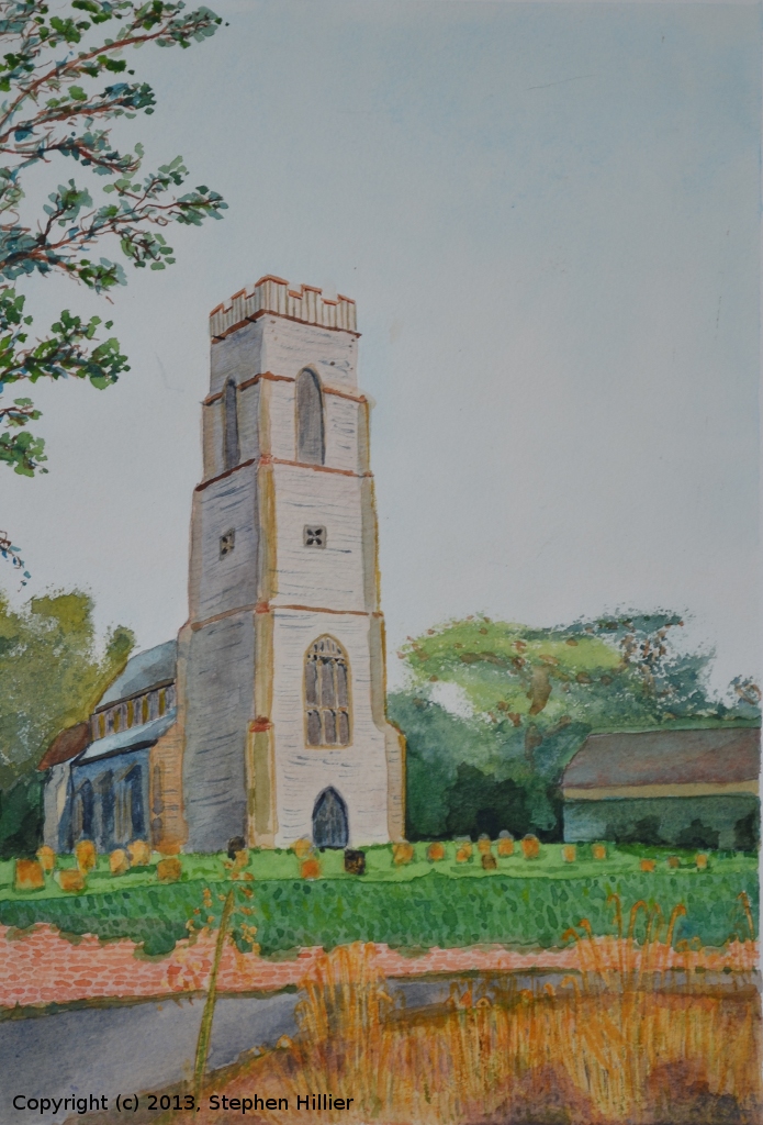
To the left is Banningham Church, one of a number of attempts to paint this church. St Nick’s Church
St Nicholas Church, Laindon is one of the most prominent architectural features in West Basildon. It lends itself to being painted, an activity that is well used by many artists.
The view to the left is from the south along St Nicholas Lane. Composite Essex
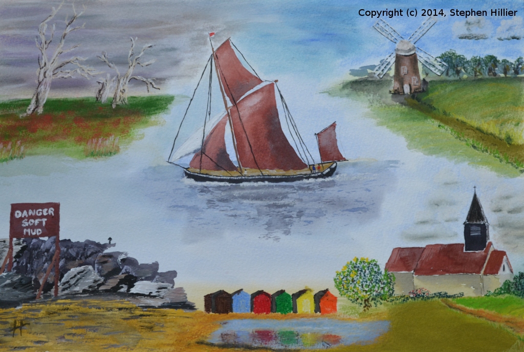
A page containing a blow by blow account of how I produced my picture titled ‘Composite Essex’ which was produced specifically for the exhibition of WHAG work at Bedfords Park, Havering – March to April 2014. Painting with CMYK
We all use our colour printer to produce full colour pictures. We are quite happy to read a newspaper or magazine and look at the full colour pictures. When it comes to our art we get a mental block. We are conditioned from an early age to consider Red, Yellow & Blue as our primary colours. Those of us who work in television or computing are happy to consider Red, Green and Blue as our primaries. In the print trade we all know about 4 colour process printing to give us full colour pictures. So try an excursion into painting with CMYK primaries. This page offers an insight to the world of CMYK painting. Take a look. Try it out. This page might offer you some clues on how to do it. A resting place for everything else
This is where I have put all the stuff I cannot think to put on their own page.