I have been doing some work with Process colours sometimes known as the CYMK palette. This range of colours which can cause great controversy are considered by some to be primary colours but this is only in respect of an understanding of the subtractive complement to the RGB primary colours of emission (or additive) spectrum. If you want to see the gigabytes of web space devoted to these arguments look for ‘cmyk colours’ on Google.
For this page I am only going to show how CMYK colours can be used in painting. First, this palette is not easy to find among paint manufacturers. I have found them in Daler Rowney System 3 acrylic and also in their Designers Gouache where they are called ‘Process yellow’, ‘Process cyan’ and ‘Process magenta’. I have found them in the Royal Talens Cobra range on water soluble oil paint where they are called ‘Primary’ colours. Winsor and Newton have Process Yellow, Process Cyan and Process Magenta (but no Process Black) in their Galeria range of acrylic paint and also have these colours in the Designers Gouache where again they are called ‘Primary’ colours. Not all ranges have a specific black in them so make sure you pick a good black.
Further on in this page you will see sources of Process colours in Daniel Smith watercolour (but be careful of the names) and some ‘Primary’ soft pastel from Jackson’s own range. I have also come across a source of Acrylic Ink in Process colours from the AV range. These are available from 3 sources on the Internet – do a search for ‘AV acrylic ink’. I have now come across some Derwent pastel pencils in this palette as well as some Derwent Artbar sticks. Full marks to Derwent for engaging in this process. Finally, and coming back full circle, for those who are interested in Lino Printing there is a range of CMYK printing inks for Lino Printing produced by Schminke.
Of course the biggest question is WHY? I have been involved in IT and computer systems since 1980 and whilst most of your will be used to having a colour Ink Jet or Laser printer at your disposal it was not always the case. When you think of replacing the colours in your printer you will replace only 4 cartridges: Cyan, Yellow, Magenta and Black (also known as Key) and this is what gives the name to the process – CMYK. Printers have for years produced colour material and this was pretty much black box stuff, however it is the same process – and this is where the name process colours comes from. But why introduce in Art? Well because it must be possible so why should we not use it? Give it a try. I can assure you it will change the way you think about your palette.
Now for some paintings
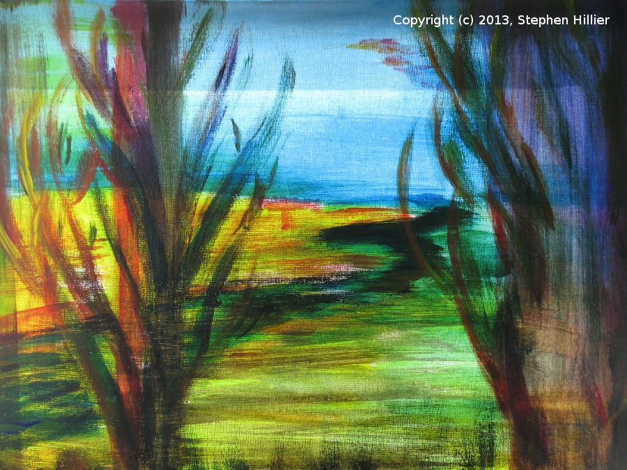
 This was my first attempt using CMYK. The picture is entirely abstract and flowed from just putting several layers of paint on initially in strips on the canvas. The final picture started to develop into what might be an underwater scene by accident. I used Acrylic paint mainly undiluted but it is heavy and dark. What intrigued me during this process is “how do I make a bright red from the palette?”.
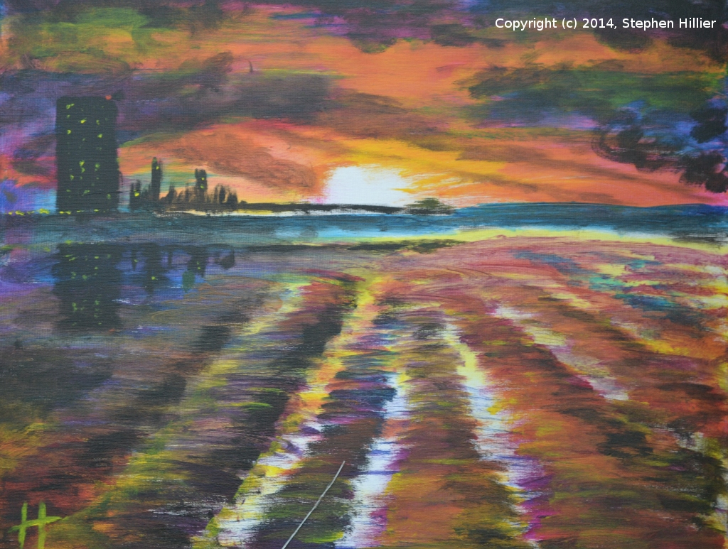
 This picture was an attempt at creating a real scene. The topic was sunset at the shore’s edge (Littorally speaking of course). Having done some research I now knew how to mix a red and spent time mixing colours. Painted in acrylic I also used copious amount of gloss medium to thin the paint. You can see the bright oranges and reds in the sky but I am disappointed with the blues but what I have realised is that you have to be very light fingered when it comes to applying the black. The heaviness of the paint still makes this painting very dark and oppressing. It does indicate that you really have to work to make a realistic painting.
To understand how to create a lightness of touch we need to look at how the print process works. Each location in a printed image is made up of dots and these dots will be a composite of the each of the four CMYK colours. The shape of these dots allows those of a peculiar mind to identify the print process that has been used for the image. An Epson printer will have a different dot pattern than a Hewlett Packard printer. Now when defining CMYK colours for a printer you give each colour an intensity number in the range 0-100. So in printing you can change the intensity or saturation of the dot and it’s size. At each location some of the colour of the support shows through even if that location is black. However in painting we are not dealing with dots but we are covering the support (paper or canvas) with whole colour. We therefore have to make sure we dilute our paint enough to allow the luminosity of the support to have an effect. Of course you can use colour straight from the tube to add detail and effect but every time you use it from the tube you are using that colour at the maximum setting of 100. Even if you mix two colours you are using each at the 100 level so you get very solid colours. For those used to watercolour this is just not natural. I would ask at this point that all the designers and printers that have a better description of the print process to forgive me. This is a page about painting in CMYK not printing in CMYK and I need only to give the reader a sufficient understanding of the process to allow them to paint in CMYK and produce an impression
 I found this image when searching the internet for images of CMYK watercolours. The original work was by Thomas Kincade, an American artist. What I liked about the image was the bright orange foliage in the middle of the picture.
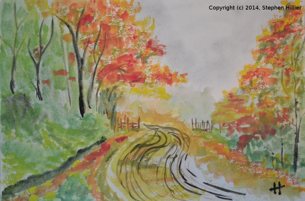
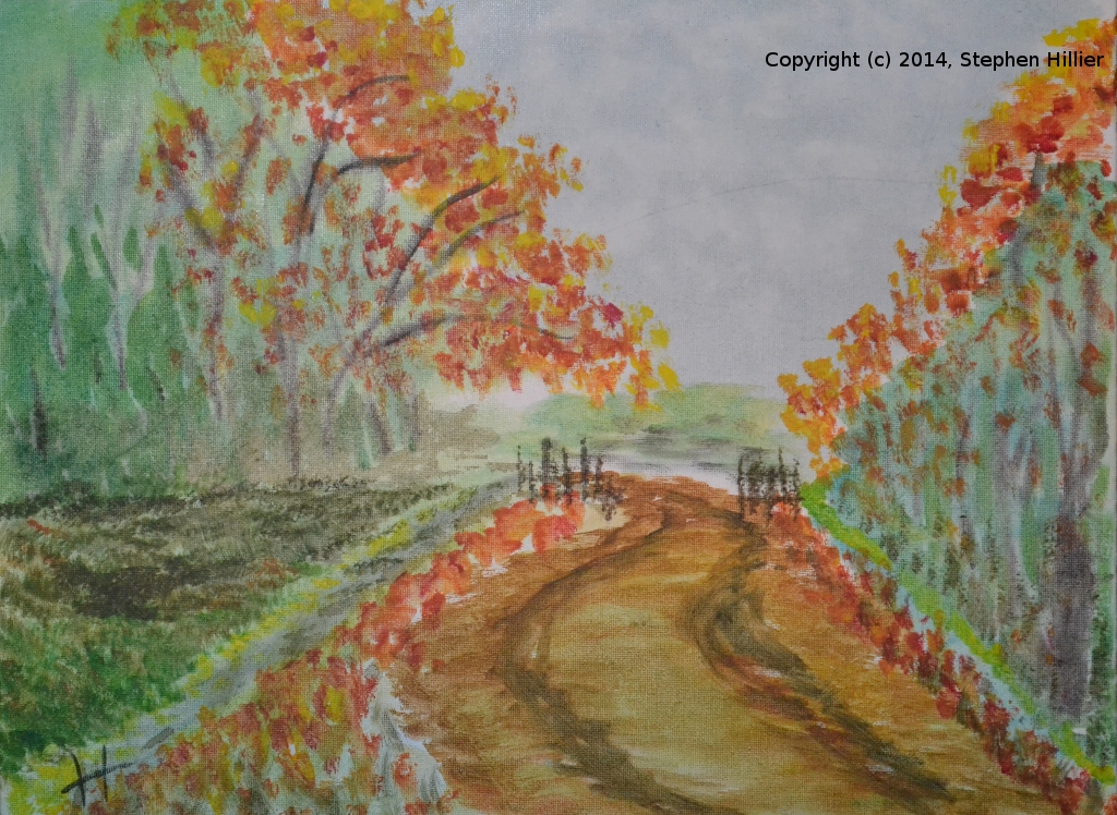
Using Daler Rowney Designers Gouache I squeezed about 1 inch of yellow and half an inch each of cyan and magenta together with a small blob of black. Mixing a small amount of cyan and black I put a wash in for the sky, allowing some darker colour to bleed into the wash to give the cloud effect. Keeping my solution very dilute I added further washes to give the background of the trees and the roadway. When mixing greens be very easy on the cyan and be prepared to use a lot of yellow. Building up the colours, adding more blue or black to get the darker greens to give tonal difference in the wooded areas. The orange / red areas were mixed from yellow and magenta being careful to use fresh brushes and palettes / mixing dishes. I used a set of mixing dishes so that I could keep reds / oranges separate from greens / blues. The trees were painted using dilute black working wet into wet. I was not too concerned about the detail in this picture as the exercise was about mixing CMYK colours. Painted on 140lb Winsor & Newton NOT paper. This painting, again the Thomas Kincade picture, was painted with CMYK Daler Rowney System 3 acrylic on canvas board (16″ x 12″). For this be prepared to use the acrylic very dilute and treat as a watercolour. Again I used the colours in proportion of twice the amount of yellow to cyan and magenta. The sky in this painting was done as awash but is was too dark so I lifted out some paint before is had a chance to dry. Unlike watercolour once acrylic dries you cannot re-wet it to lift it out. As with the gouache painting above the trees were added by applying successive washes of darker colour. Normally when using acrylic I mix on a paper plate (I can throw it away when I have finished), however because I was using dilute washes the paper plate was not the ideal. I will try some plastic picnic plates next time. Similar to the gouache painting I tried to keep my colour mixes separate by using different mixing dishes / plates. Again I tried to keep the work wet so that I could bleed the trees in. Being acrylic it would be quite easy to add detail using relatively undiluted colour but beware the black.
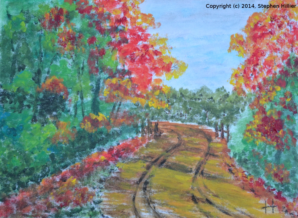
 Once again the Thomas Kincade picture. This time is water mixable (miscible) oil from the Royal Talens Cobra range of paint. Painted on canvas board (16″ x 12″). For this I used a wooden palette and some palette knives to help mix the paint. The proportions are as before with a lot of yellow compared to cyan and magenta. To obtain the dilutions I used copious amounts of Royal Talens Painting Medium for water mixable oil. Being oil you have to be a bit more careful not to mix on the canvas and produce a muddy brown colour. The sky is again cyan with a little black mixed in taking care to keep this dilute as there is no white to put in clouds later. The bright greens on the left are various mixtures of cyan and yellow with some black to give the shadows. The green in the distance was black and yellow giving an olive green. I liked the way the red leaves turned out but some of this brightness was achieved using pure magenta and allowing the adjacent colours to tone is down a little.
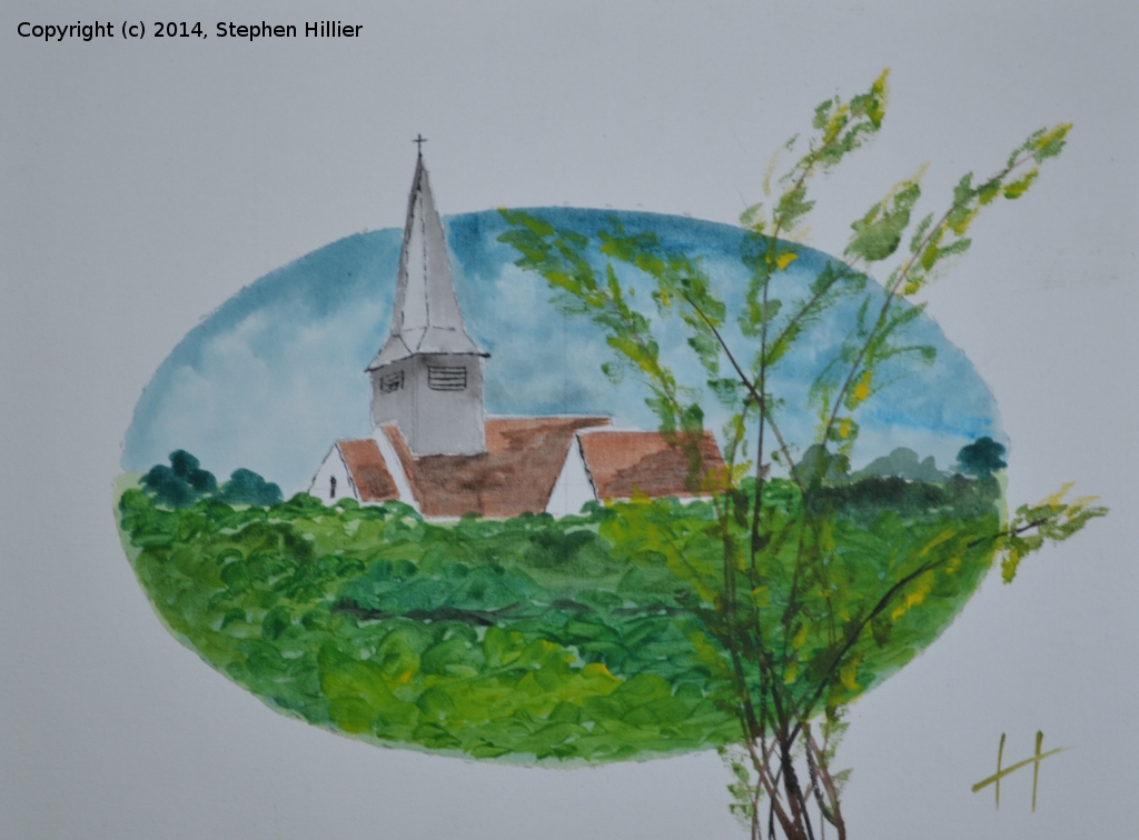
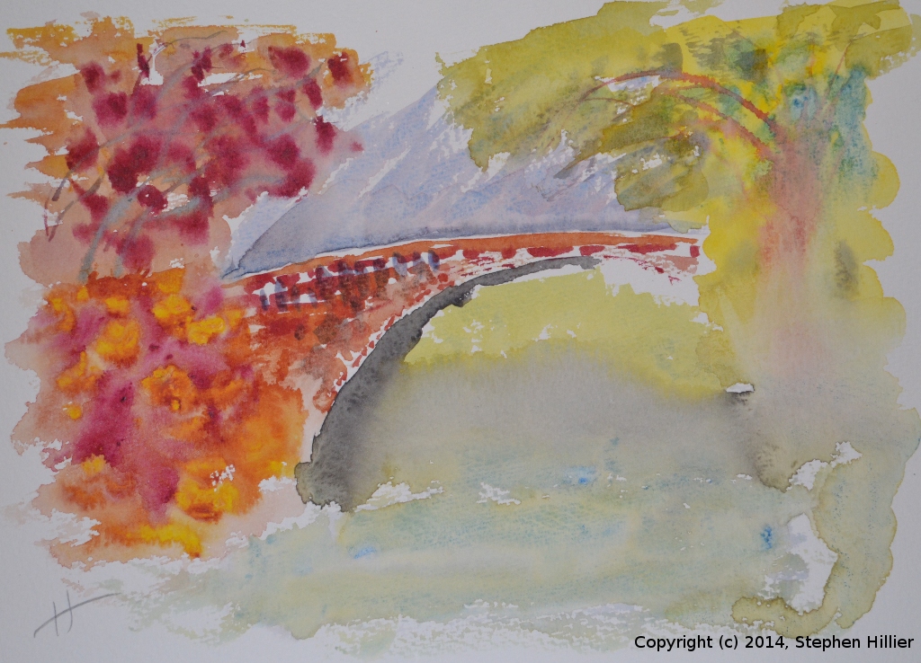
 Now this is getting more like it. If I didn’t tell you, you might find it hard to think this was done in cmyk colours. On canvas board (16″ x 12″) using Daler Rowney System 3 cmyk colours. I drew in the ellipse in pencil to give me the edges and then did a light pencil sketch of the church. First was the sky. Using the same technique as for the acrylic Kincade painting, a mixture of cyan and black allowed to bleed into a clear water wash and then lifted out to provide the clouds. Then a pale wash of green to set the ground in place. Having allowed the sky to dry I was able to put the tower and spire in place using a very dilute black – just as you would with watercolour. The edges in the louvres was done with as stronger black mix using the very edge of a flat brush. Next the terracotta coloured roofs. A mixture of yellow and magenta firstly bled in a wash and the darker colour added a bit later by adding a little black to the palette. For this painting I obtained a few cheap plastic picnic bowls and I kept my blue mixtures away from my greens and reds. The greenery in the foreground was painted using various mixes of cyan and yellow. I simply altered the mix and applied using a No. 6 filbert to give me a variety of colours in the picture. I used a little black in one or two places to give me some shadow. Finally the trees in the foreground. The branches were a careful mix of all three primary colours with a little back added where necessary. the stems were painted with a rigger. Finally the leaves were applied using the edge of a No 4. Round brush using some of my green mixes. Some of the light tones were added using almost pure yellow. I said at the start this is more like it. I am beginning to feel that it is possible to use these 4 basic colours as an artists palette without compromising the finished painting. I hope one or two of you might agree.
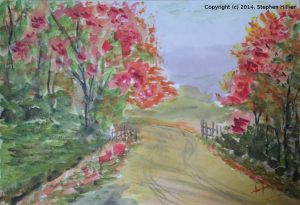 I have been looking to find a watercolour equivalent for process colours without success. Then I came across some work by a Canadian artist called Ashley Picanco. She has done a lot f work using a cmyk type palette. I could not find any paints equivalent in the normally available UK makers but I did find some Neutral Tint. I produced this image of the Thomas Kincade picture I have shown above. Mixing the colours followed as described above. When I reviewed Ashley’s work I realised she uses Hansa Yellow (medium) which I now have on order but the range also has Quinacridone Magenta, so some of that is on it’s way to me. The Hansa yellow light is a little too lemon for my liking but at least there is a palette that comes close to cmyk in watercolour.
 These two paintings were done in a tutorial so look at my tutorials page for more details. Both were painted using the Daniel Smith cmyk watercolours. On the left this shows you can get a good depth of colour and on the right, the ethereal look of Ireland in the wet.
 Again using Daniel Smith watercolour – Quinacridone Red, Cerulean Blue, Hansa Yellow Light, Neutral Tint. This painting was painted from a picture published in the Daily Telegraph. In this picture, which I don’t think is a finished article, was an exercise in mixing CMYK colours. There is very little of the red. The hills in the background – a lot of yellow, some red, some black. The hills in the front a lot of yellow and blue with increasing amounts of Neutral Tint to define the hills. There needs to be more compensation for the fact the water colour dries lighter than when wet. I am pleased to be able to get the quite bright greens.
 For this picture I had the Hansa Yellow light and the Quinacridone Magenta from the Daniel Smith range of water colour to go with the Cerulean Blue and Neutral Tint.
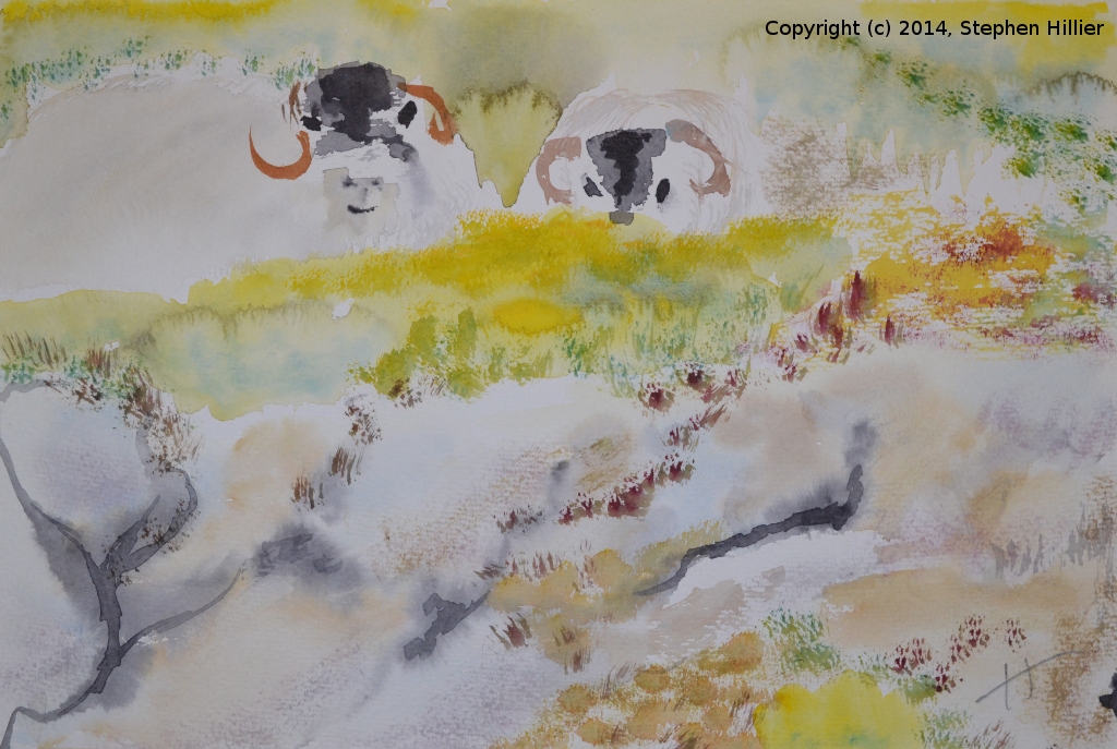
At the same time I got a book by Jean Haines, “Atmospheric Watercolours” so this painting is very much an exercise in two parts. I was using the Jean Haines methods with the CMYK colours. I like the very bright yellow top right and I think the magenta top left is effective. A lot of work was done wet on wet and the whole picture took maybe 40 minutes. The bottom right is a bit of a mess as it is undefined, but once again the CMYK colours do their trick. This painting was done as part of tutorial in Gardens. See the Tutorials page here. Using the Daniel Smith watercolour (Hansa Yellow light, Quinacridone Magenta, Cerulean Blue, Neutral Tint) this was done with a number of washes getting progressively darker. The reference was chosen because of the range of colour contrast it held. Detail was added using dry brush techniques. The stone wall in the foreground lacks definition, however the light yellow allows greater range of greens than the medium yellow.
In some ways working in CMYK watercolour is an advantage in that you can better follow the rules of building up colour in layers which of course is the water colourists technique. Oil, Acrylic, Pastel all have dense pigments which can swamp the white which it is important to retain in CMYK. Back to the Kincade picture. This time in CMYK pastel. I found Jacksons offered some process colours in soft pastel so I got some. I chose lamp black as the key colour. Painted on white Mi Teintes pastel paper. A very different techniques required here. Pastel being almost pure pigment will soon swamp the painting and blot out all the white which is needed in CMYK painting. So I started with a ‘wash’ or in fact a series blocking out the main areas in a base colour. I found applying the pastel directly to the paper soon wrecks the painting I using some kitchen paper towel I rubbed the pastel onto the paper and then applied the paper to the painting. This way I could blend the pastel better. However this method leaves a very pale washed out painting which need strengthening. I then applied pastel directly to the paper in small areas and blended the colour progressively building up the colours. Finally to give some detail to the trees and the roadsides I applied pastel directly without blending. I was at an disadvantage in that I forgot to take any blending tools with me to this session so there is plenty of my DNA on the painting from blending with my fingers.


Footnote. Search the web on this topic and you will find hot debate about the use of CMYK and whether these should be considered as Primary colours. As artists, in our younger years we are taught that the 3 primary colours are Red, Yellow and Blue RYB and we are all happy to proceed along this path. For most artists this is enough, you have a palette of warm and cold red, yellows and blues from which you can make any other colour you need. Then come computers (and televisions) which use a different set of primary colour called the RGB palette comprising Red, Green and Blue. These are primary colours for additive colours where the colour is produced by emission spectra. Mixing these colours gives a full range of the spectrum but mixing all three colours gives you white not black and somewhere in this mix you will find Magenta, Cyan and Yellow. So the whole concept of what are primary colours gets blown sky high. However if you start with Cyan, Magenta and Yellow using pigments, which are subtractive colours (absorption spectra) you can define a whole new palette of Primary colours and this is what the CMYK palettes give you.
Just a quick note on emission and absorption spectra. You can project a pure colour in light you can emit a stream of light of say a red wavelength directly. This and all other wave lengths of emitted light is an emission Spectrum. Mixing a little bit of red and a little bit of blue will give you a magenta. When you are trying to get colours from pigments you are using absorption spectra. What a red pigment means is that the pigment absorbs light from the blue and yellow parts of the spectrum and thus reflects only the red light. As you add more colours more of the visible spectrum gets absorbed by the pigments used cutting off more and more reflected light. Thus mix all three subtractive primaries and you get black (or close to it) because all light is being absorbed.
Finally in this footnote I want to address what appears to me as a fallacy in the debate on this subject. Many people argue that the ‘TRUE’ primaries for art is the RYB range, arguing that this must be the case because paints of these colours have been used by artists for centuries. This argument fails to acknowledge that the early artists were restricted in their colour range to the colours available to them from pigments they dug out of the ground. Since those early days the chemical industry has been able to create a whole new range of pigments and this has enabled the production of the pigments used in CMYK printing and painting. This also influences where you can find the paints. A number of paint manufacturers reserve their Artist’s Ranges to the naturally available pigments thus it seems easier to find CMYK colours in the Student colour ranges. Please don’t make me a liar because you find CMYK in some ranges of Artist’s acrylic because I know they do exist but they are not universally available in Artists colour ranges.