My father was a good artist but his output was not very high. He did a lot of work in pencil and some work in pastel but it was adding colour to his pencil sketches which first inspired me to attempt to paint. I had some mediocre attempts in 1983/84 which I will not publish and I took some lessons with Liz Moon in 1991/92. This page has a mixture of pictures, some of which I have painted directly from my fathers drawings and some where I have visited the site of his original and drawn my own work. I have tried on this page to give a history of each picture as I know it.

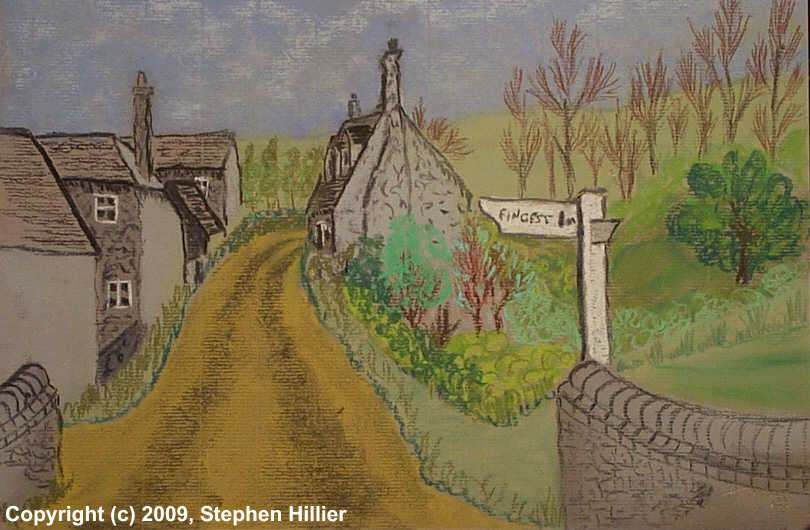
 The pastel painting on the left was taken from a sketch drawn by my father LGC Hillier in 1936. Titled ‘Turville’ it is actually a view in Skirmett, the next village down the road.
In 2012 I visited the site and produced my own sketch and the ink and watercolour painting on the right. I removed the extraneous street furniture that had accrued over the years. The parapetted bridge in the original has now gone and had I stood where my father stood I would have been run over several times whilst drawing the sketch.
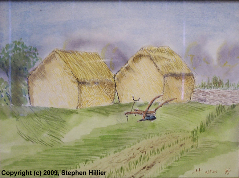
 ‘Sweet Acres’. On the left – soft pastel. On the right – watercolour. The original for these paintings was a pencil sketch drawn by my father in 1939. I am particularly pleased with the foreground in the pastel copy although the clouds could be improved. The poor image quality of the water colour results from it being photographed behind glass.
 I bought some AV Indian Ink. One is a lovely violet colour so I tried it out on this subject. The work was completed in a single 2 hour session.
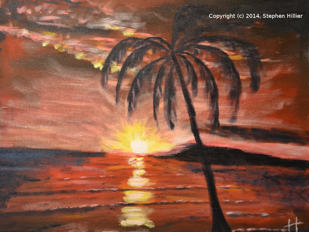
Painted on 200 gsm Fabriano Drawing Paper. Dated September 2014.

My parents when they first married lived in Sawbridgeworth and I have a few pieces of my fathers work from that period. This is a piece he entitled ‘Sawbridgeworth’.

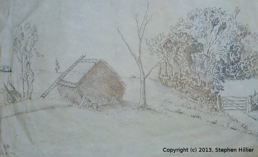
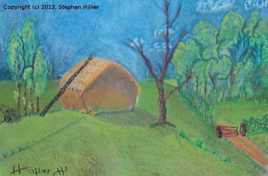
 ‘Sawbridgeworth’. On the left is the pencil sketch I worked from, first sketched in 1938 and redrawn in 1993. On the right is a pastel version of this image.
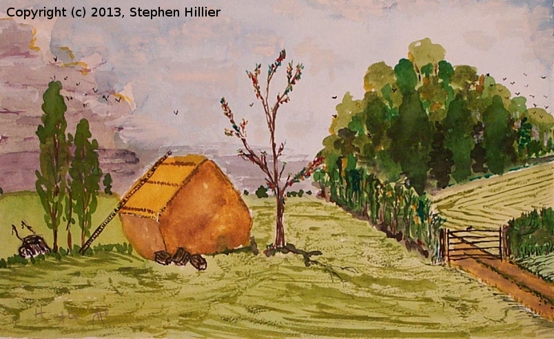
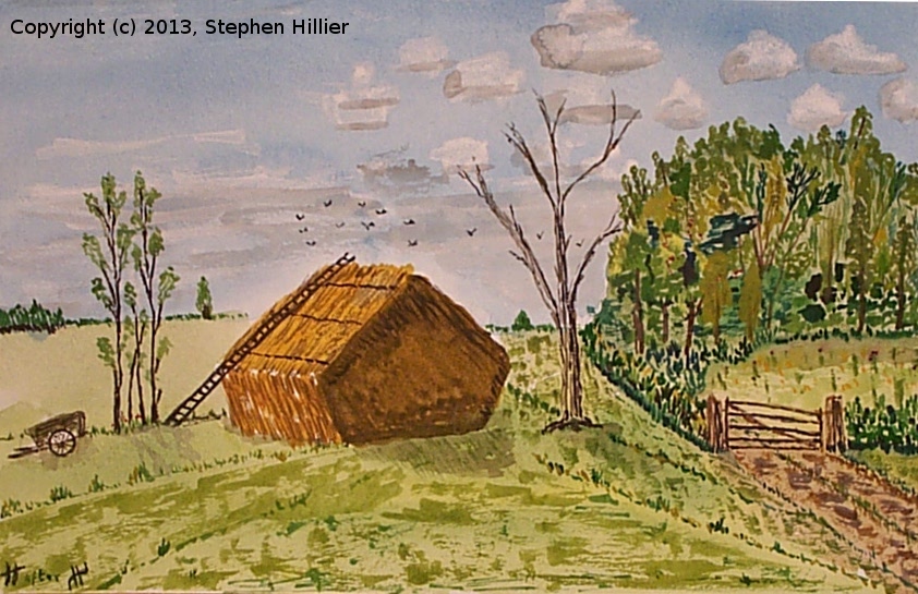
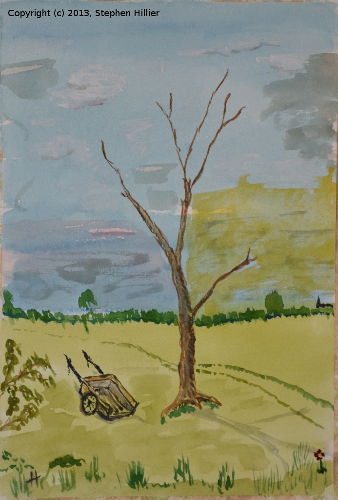
 Two watercolour versions of this image. In the right hand version I got tired of painting the tumbril (tumble cart) upright so I set it with the shafts on the ground.
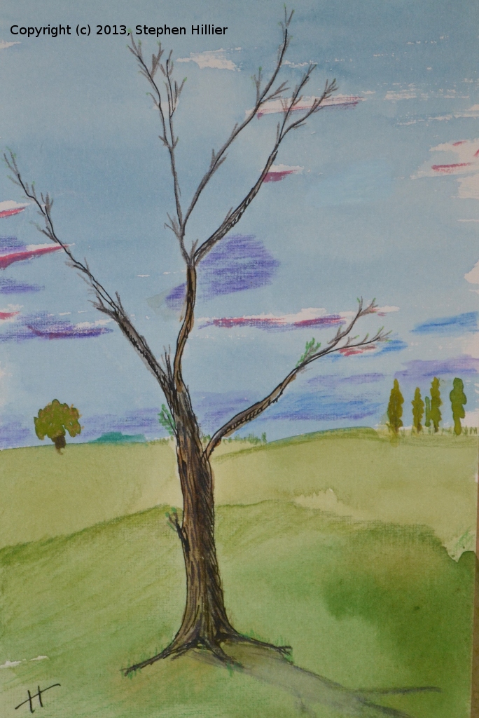
 The tree in the foreground on the picture above was giving me some problems so I spent a little time trying out some effects.
On the left an image painted in Indian Ink, Watercolour and Aquarelle pencils.
On the right an image painted with watercolour. Note that here I also tried out what could be done with the tumble cart. Both pieces dated in 2009.
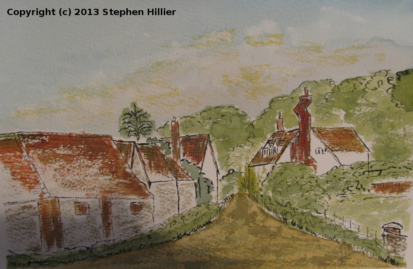
 On the left a watercolour painting of the signal box a Maiden Newton, Dorset. I was visiting my grandchildren and sketched this scene. Painted in watercolour on 140lb Langton Rough paper.
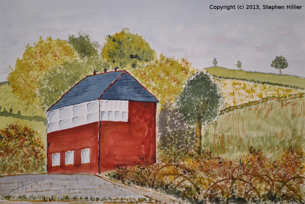
On the right a picture of a barn at Potter’s Crouch in Hertfordshire. Painted in Unison soft pastel (Natural Earth range) on Mi Tientes paper.

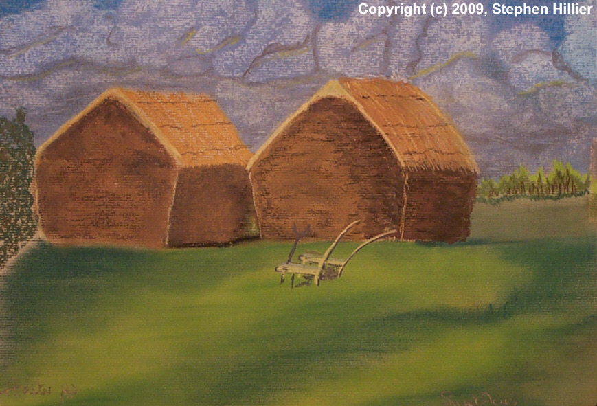
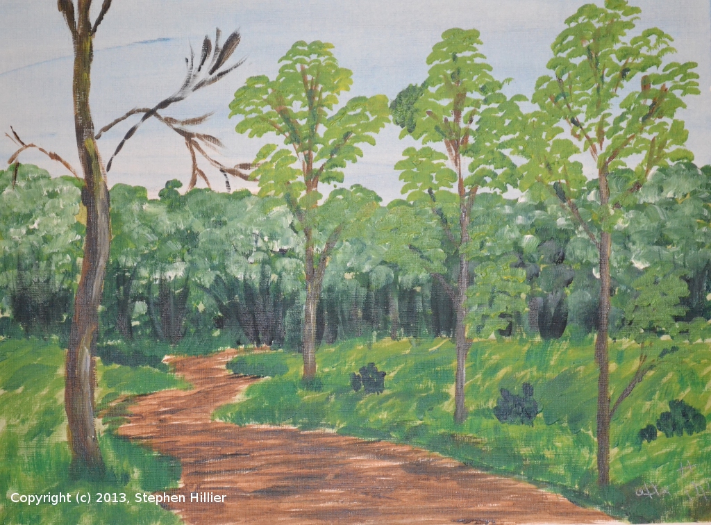
In April 1936 my father had a trip round Epping Forest. I have 4 sketches drawn on 12th April that year. The first is the Barns at Upshire and the last is the Church in High Beech. Having once tried using acrylic paint and in preparation for the Tutorial from which ‘Westminster Bridge’ was painted I thought I ought to get some more experience using acrylic paint. I chose as a practice piece a sketch called ‘A forest clearing’ drawn by the old man on that April day. Below are the results.

 On the left the first attempt. Applied fairly thickly. The sky is awful and I had trouble getting the branches on the tree right.
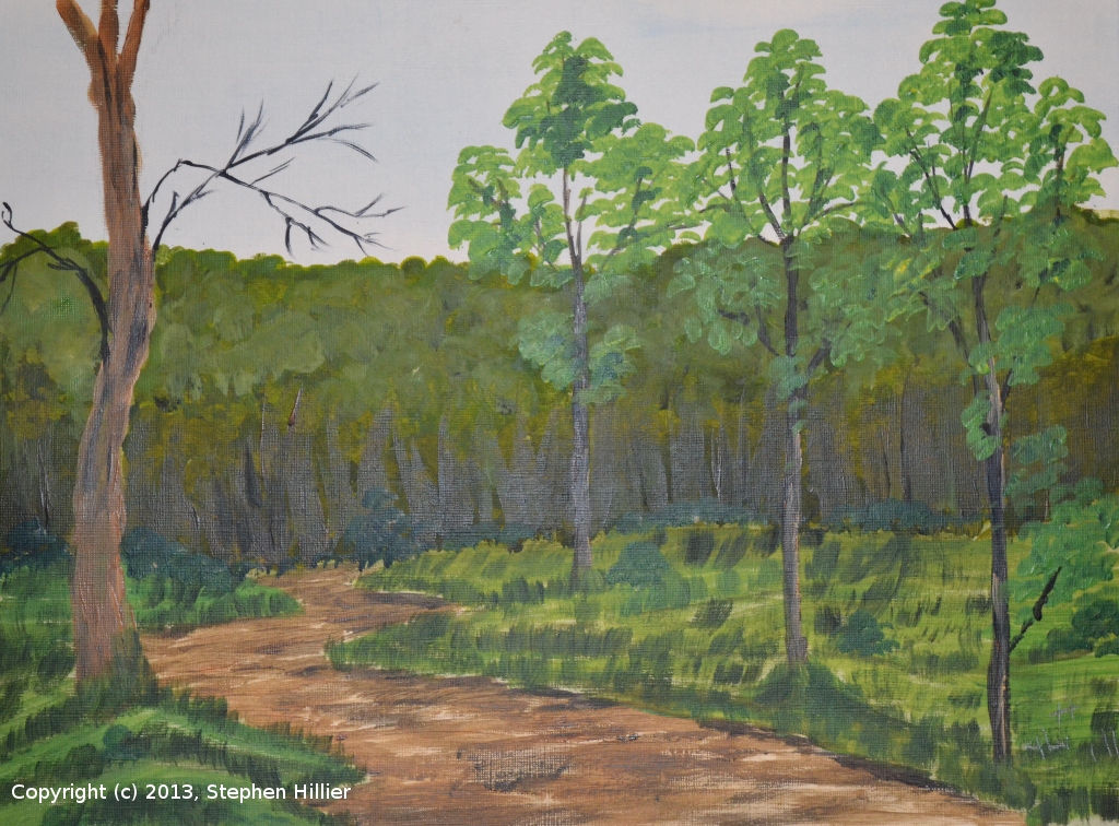
The second attempt, the sky, background trees and foreground were first applied as a thin wash. The indistinctness of the background is good but the foreground tree do not stand out enough.
 On the left attempt 3. Colours used: Ultramarine, Cadmium Yellow, Lemon Yellow, Raw Umber, Yellow Ochre, Paynes Grey. A wash of white was applied to make the background tree recede.
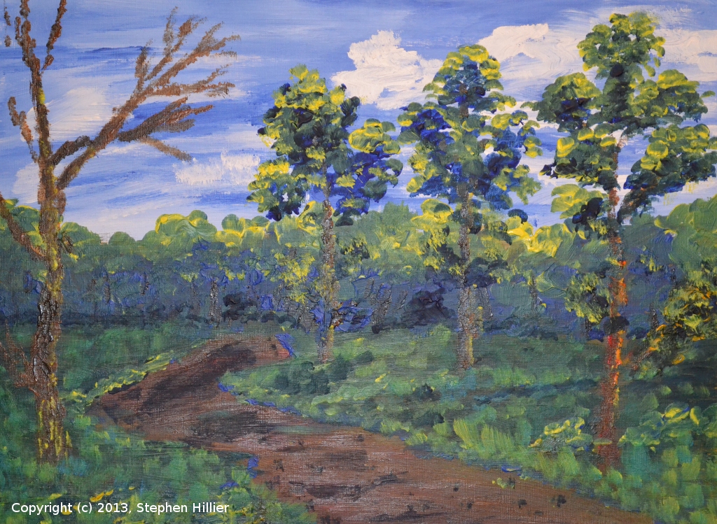
On the right probably my favourite, except it is autumnal not vernal. Colour used: Prussian Blue, Cadmium Yellow Deep, Raw Sienna, Paynes Grey, Titanium White.- <

 On the left No 5. A wash for the sky. The background trees are better with the trunks more defined. Colours used: Prussian Blue, Lemon Yellow, Paynes Grey, Titanium White, Raw Sienna, Yellow Ochre, Phthalo Green.
On the right No 6 – yawn… Still trying to get the branches on the main tree right. The Paint was applied fairly thinly. Colours used: Prussian Blue, Lemon Yellow, Raw Sienna, Yellow Ochre, Naples Yellow, Paynes Grey, Cadmium Yellow, Cerulean Blue. 
 On the left and painted after the tutorial. I tried to use the fast and loose techniques favoured by Roger and allowed colours to mix on the page. Again that wretched tree does not want to go right. Colours not noted but it looks like Ultramarine and Lemon Yellow are the main colours.
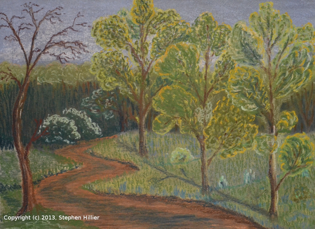
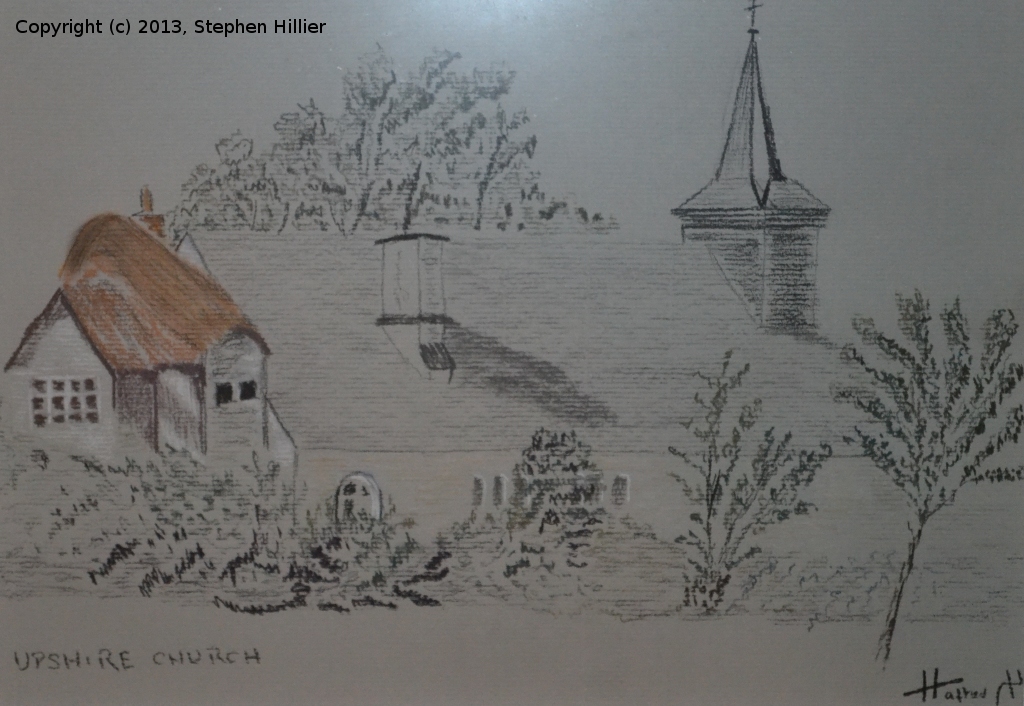
On the right and just for a change the same scene in Pastel. Not too bad but I messed up the row of three trees making the furthest away tree bigger than the nearer ones. This painting of Upshire Church is painted in tinted charcoal taken from an original sketch by my father drawn in about 1936. In 2010 I visited Upshire and found the church. The Church itself has changed very little although the bungalow to the left now longer has a thatch roof. I took some photos and maybe one day I will do a painting in today’s likeness.
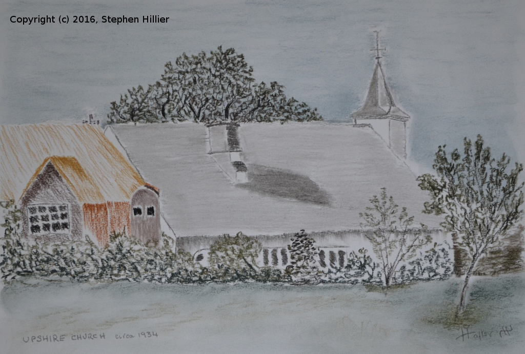
Using the Church Notice board I also phoned the Church Warden who very kindly came and spoke to me. He indicated that his parents had lived in the bungalow so he was quite interested to see the sketch. Another copy of Upshire Church. This again is in tinted charcoal from the original sketch. Having made a visit I have a better idea of what is happening to the cottage on the left of the picture so I have used some licence to make this fit better. I offered this to St Thomas’s Church and they have accepted the gift. When I last heard they were trying to decide where in the church it should hang.
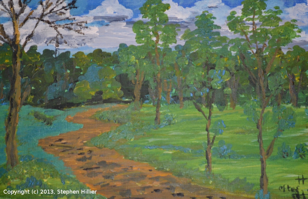
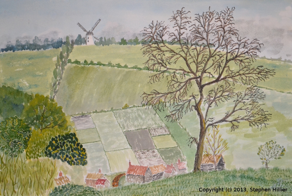
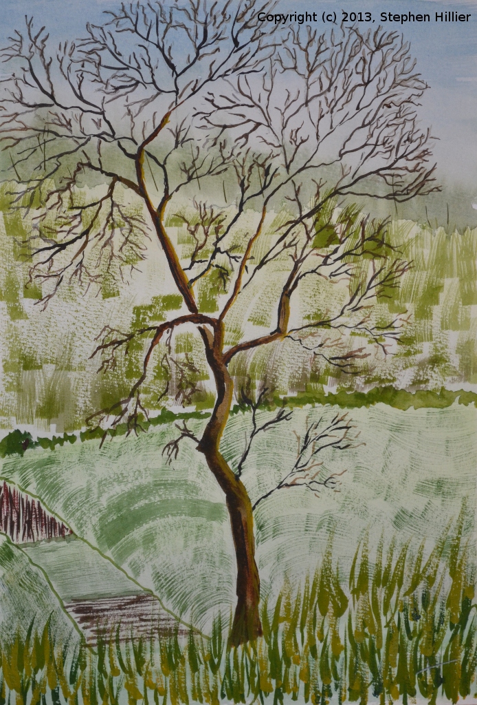
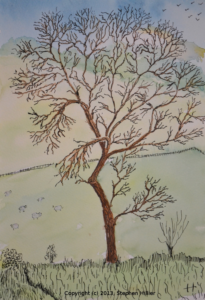
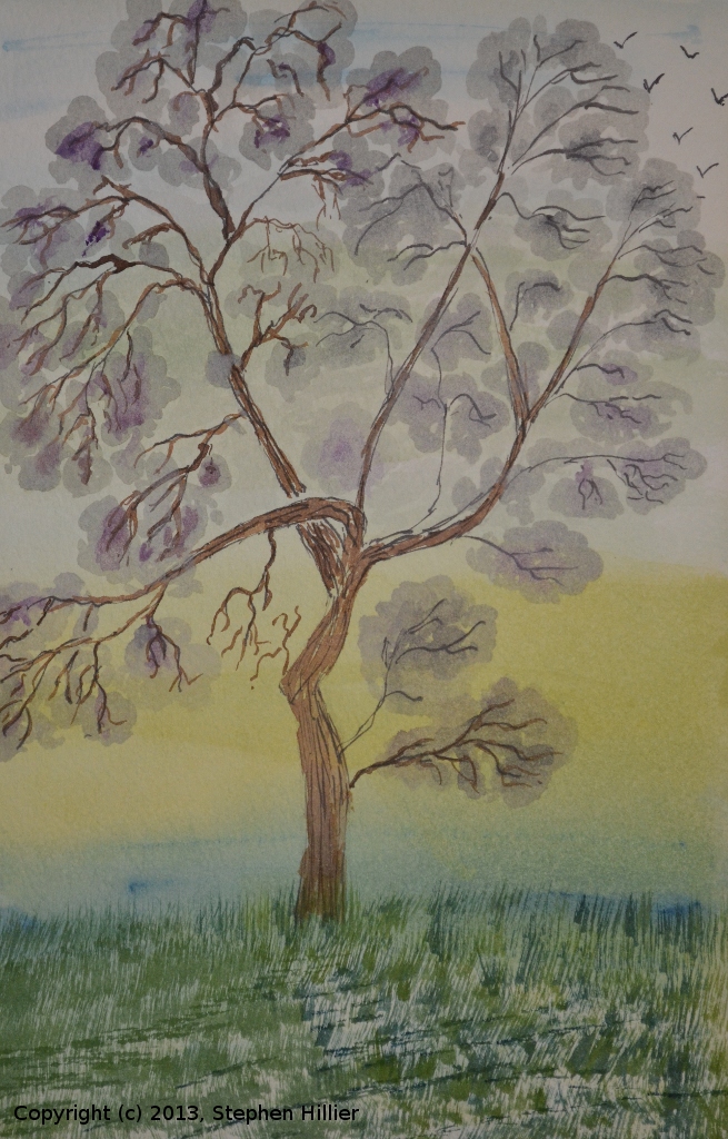
In April 1936, the old man had a walking holiday around High Wycombe and it was on this journey that the sketch of Skirmett above was drawn. On the 25th a sketch was drawn of Ibstone Mill seen from across the Turville Valley. In the 1990s my father did a larger scale pencil drawing of this scene. I took the original sketch and created the painting from which the following paintings were created.
 I made the pencil sketch for this painting around 2009 and it sat unfinished for 3 years. This final painting is predominantly watercolour but some of the detail on the tree are drawn in Indian Ink.
In 2012, on a pilgrimage, I visited Turville in 2012 and I think I found the spot from which the original was drawn (it was on a public footpath), however the hedges are now grown up so the view is blocked. However, I found a way through and managed a sketch of my own. The vista today is not as interesting as it was 70 years ago, the village is less distinct, the large tree is gone as are the fields in the background.
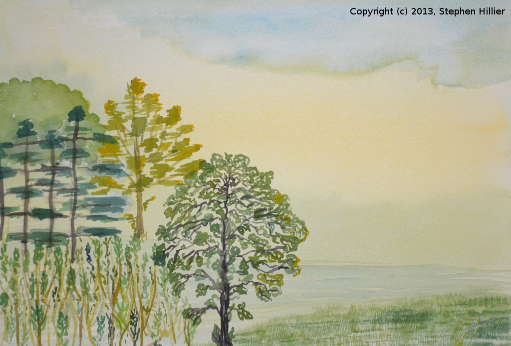
Having painted most of the work I wanted to make sure I got the tree and the foreground right. Reference the following paintings.
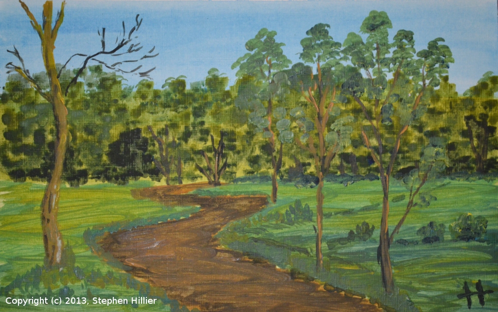
 Both these pieces are painted in water colour.
On the left the wash did not go as well as I had hoped, otherwise the composition is OK. The bottom left corner does not work.
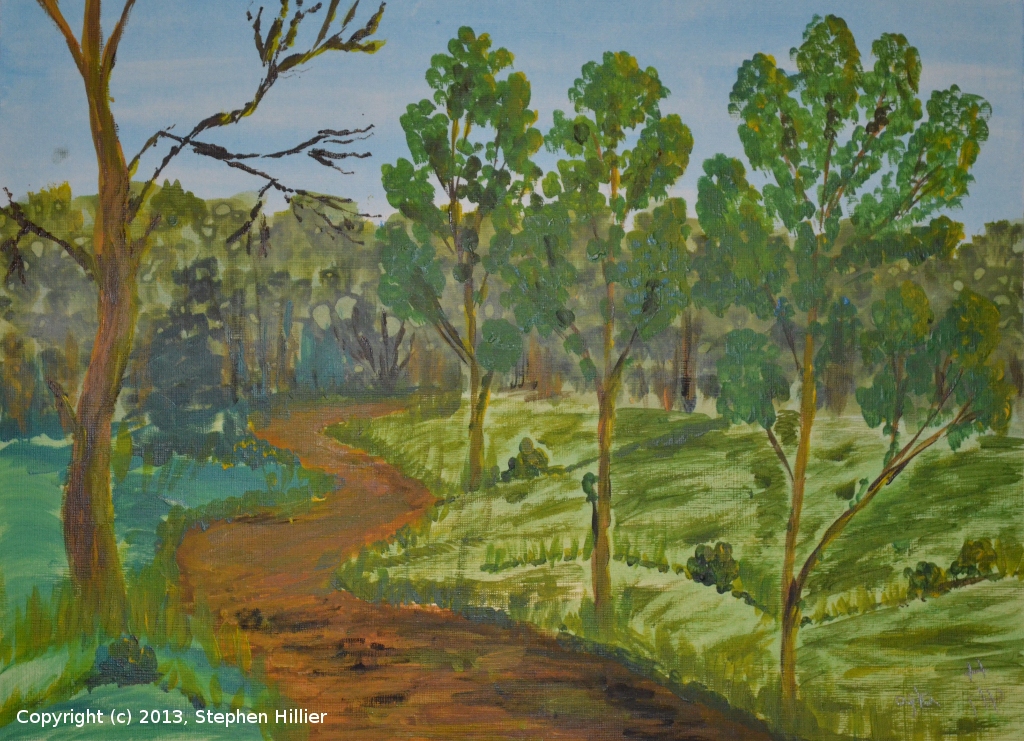
On the right the wash is much better, the trees work better and the blueness of the conifers makes them more distinctive.
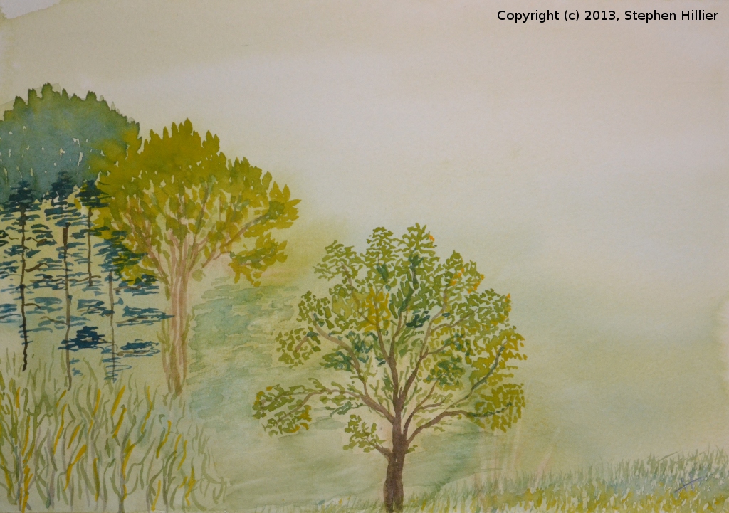
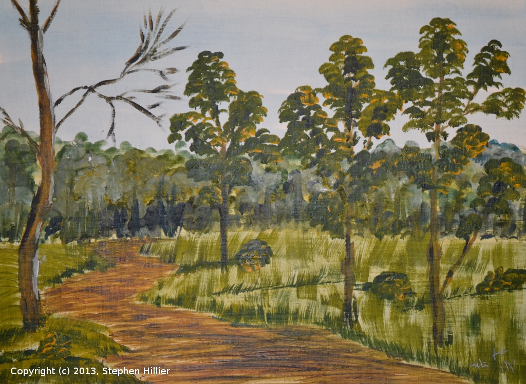
 On the left a lot of runs in the wash particularly in the right foreground. Tried to cover it up with some grassy brush strokes but it is still noticeable.
On the right, in overall terms probably the best of the bunch but I put the central tree about an inch too far to the right.- <

 Again two watercolours.
On the left a wash I did which I thought had gone so well that I would only spoil it by doing the over painting – so I left it.
On the right, the tree being the important feature, I used a No 1 rigger to do the work on the tree. Remembering that the original sketch was drawn in April the tree in not yet in leaf. 
 Two more attempts a getting the tree right.
On the left I used watercolour to do the main painting and then used Indian Ink to try to draw the twiglets on the tree. Very time consuming and not as good as defining the tree as I had hoped. However this is the method I used for the final painting.
On the right having seen a picture where the the tree outline was painted by wet on dry washes I tried this here. Painted entirely in watercolour on grey tinted Bockingford, this type of work may have its place but it would not give the effect I wanted for my final painting.
 Over the Christmas break my eldest grandchildren came to stay for a few days. My grand-daughter, then aged 12, wanted to try out the acrylic paint we had given her. The scene in Skala Sikaminias in Lesvos, Greece taken from a calendar photo. One painting in mine, one is Ellie’s.
 Two days later Ellie decided she would like to do more painting. She chose this image from the internet and we painted it direct from the computer in acrylic. I would get you to guess who did which painting but the copyright notice is a bit of a give away.