Painting with a limited palette makes you think differently about a picture. You cannot get hung up about colour but have to look for shape and tone.
What is rule number one for painting with a limited palette. There are no rules. Whatever rules I impose upon myself I can overrule when ever I feel like it but for simplicity it is about reducing your colour options and making it work. This can range in watercolour to be just two colours. In the case of the acrylic work I have done it is in effect a single colour although I have used white to make sure the canvass is covered. For pastels I have used a number of colours but in the same colour range. Unison pastels are good for this because you can buy sets of single colours eg. Blues or Blue Earths. Don’t forget that you can also use tinted watercolour paper or different pastel papers to give different effects. Working from black and white images is good for this type of work because your reference material has already reduced the colour palette so you can work simply from the tones, shades and shapes to try to get the right effects.
Go on. Give it a whirl. It might surprise you.

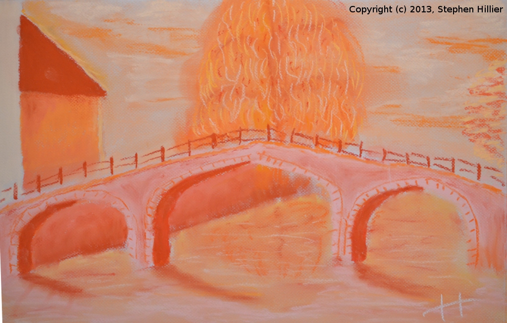
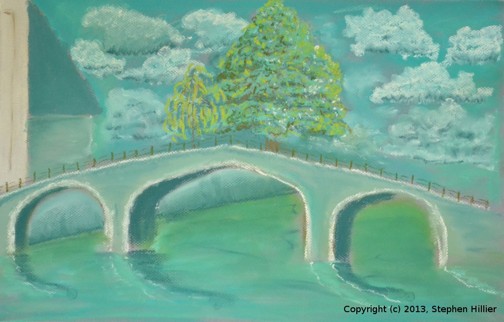
 These two pastel paintings can be found on my ‘Bridge at Begijnof’ page here but are examples of using limited palette. In each case the palette consisted of about 10 tones of the same basic colour.
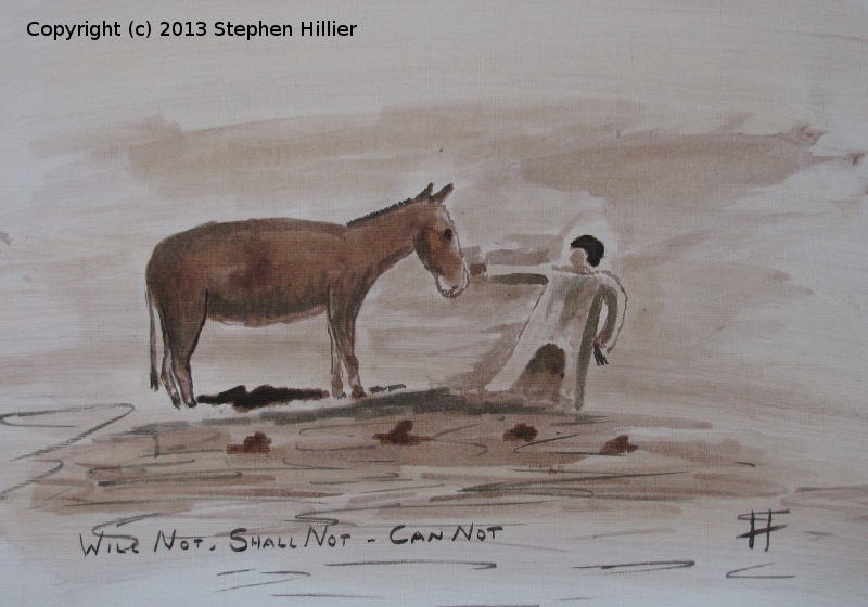
 My ‘Along the Nile’ page here has these two paintings and others of this subject.
 This painting was deliberately set out with the intention of displaying the use of a limited palette. I happened to be reading about the range of greens that can be obtained from Indigo and Gamboge. This painting was done on Grey 300gsm Bockingford using ONLY Indigo and Gamboge from the Rembrandt range of Artists Water Colour.
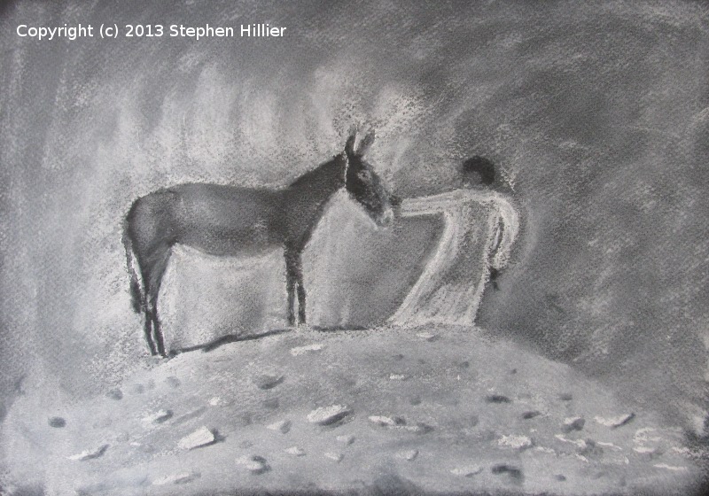
I don’t know what the effect would have been on white paper and the grey was deliberately chosen to give some background colour for the stonework of the bridge.
Overall I am pleased with the effect (it wouldn’t be here if I wasn’t). Juxtaposing contrasting colours helps achieve the effect, for example the bridge itself is light wash of Indigo whilst the underarch is just a stronger mix of the indigo, the tree trunks being light and dark alongside each other.
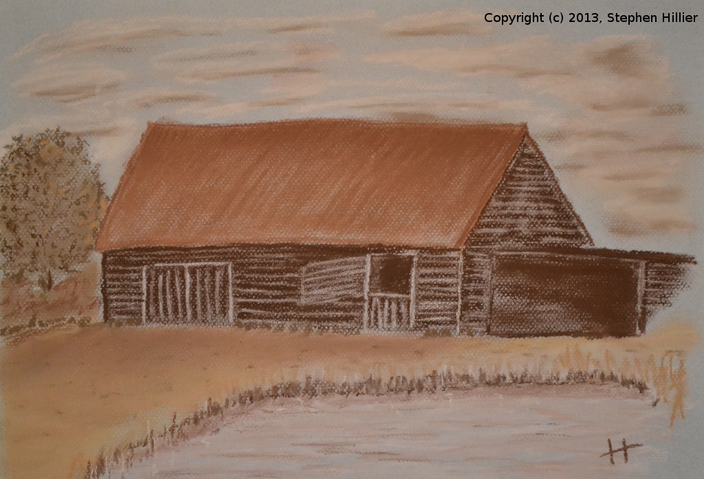
Follow this link to see other paintings in Indigo and Gamboge Barn at Potters Crouch. The significance of Potters Crouch will appear on my ‘Keep it in the Family’ page sometime. This pastel painting was done using the Unison Soft Pastel Natural Earth 1-18 range of colours.
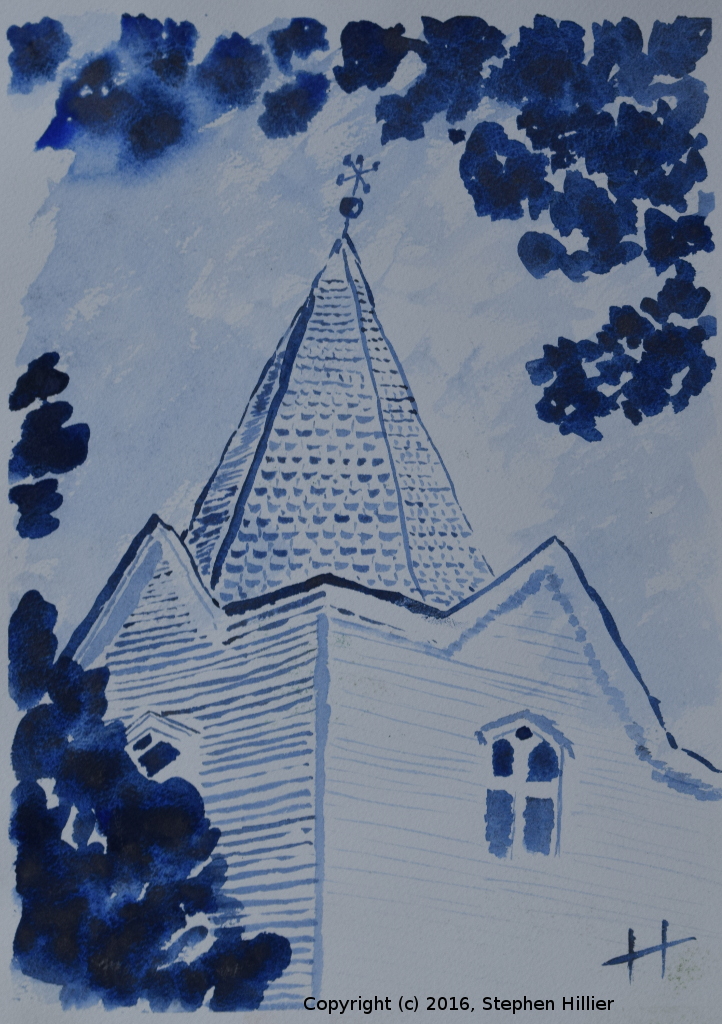
 On the left, this picture of Laindon Church is painted in watercolour using only sepia and olive green.
On the right a painting which is also on my ‘Tutorials’ page was painted with only four colours, Ultramarine and Paynes Grey are two, there was also a purple for the clouds and a sepia.


In preparation for a Tutorial on Billabongs and Gum Trees I had a look at the work of Len Hend the Australian Artist. He has a series of short lessons entitles “Paint with Len”. I had a look at a few and then tried some out. Each of the painting below took about 30 minutes, maybe 45 minutes for some. The method lends itself to working fast as does the medium. The more discerning of you will notice something about the picture titles.
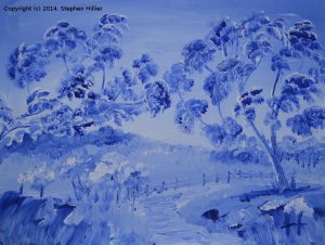
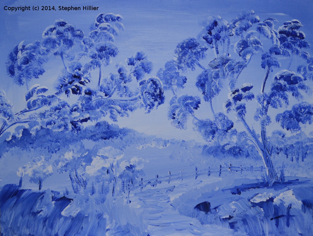
 Left – ‘How Blue Can You Get”. Painted in acrylic, White and Ultramarine Blue on canvas board. I do like the luminescence that seems to come through. A pleasing first attempt.
On the right – “Cherry Red”. Acrylic on canvas board. I looked at a tube of Permanent Rose and thought – “Let’s give it a go”. It didn’t work. There was not enough contrast to get it right. I cheated and got a small amount on Crimson and used to to add the depth of colour.
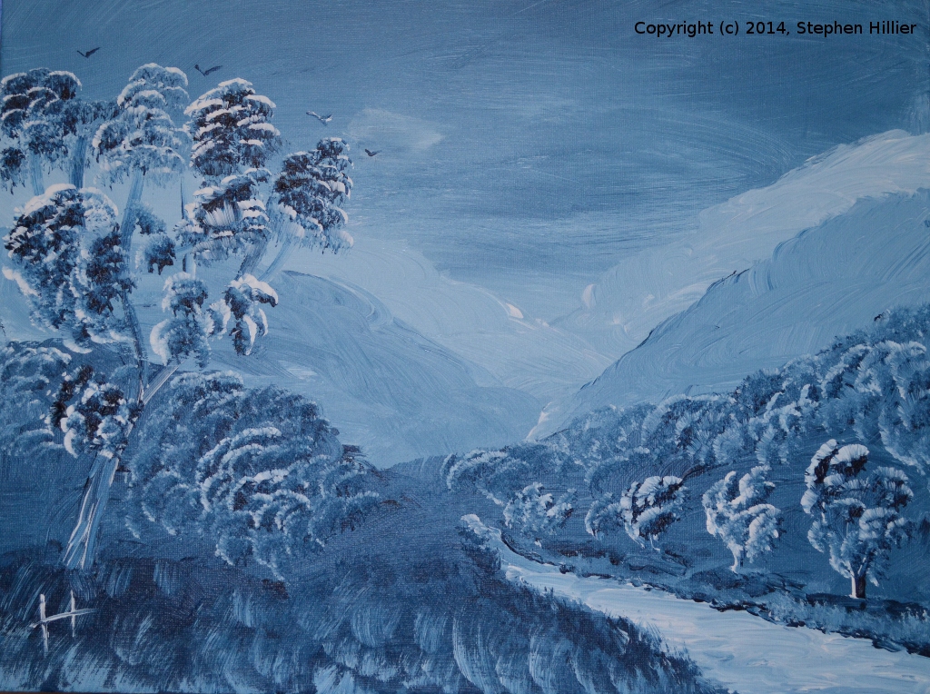
 On the left – “Mountain High”. Acrylic on canvas board. White and Prussian Blue. The feature here was to try to get the recession in the mountains. It’s OK.
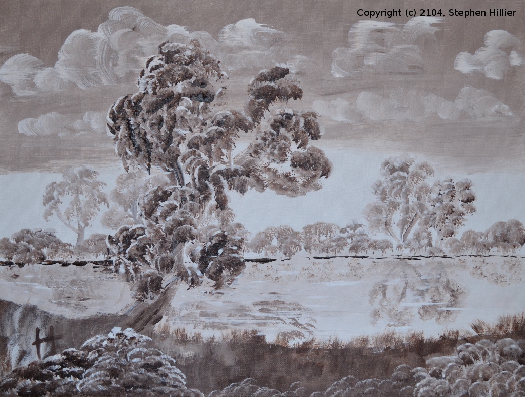
On the right – “Reflections”. Acrylic on Canvass board. White and Burnt Umber. The feature was obviously the reflections. I rather like this one. Without really trying I managed to get some recession in the far river bank.
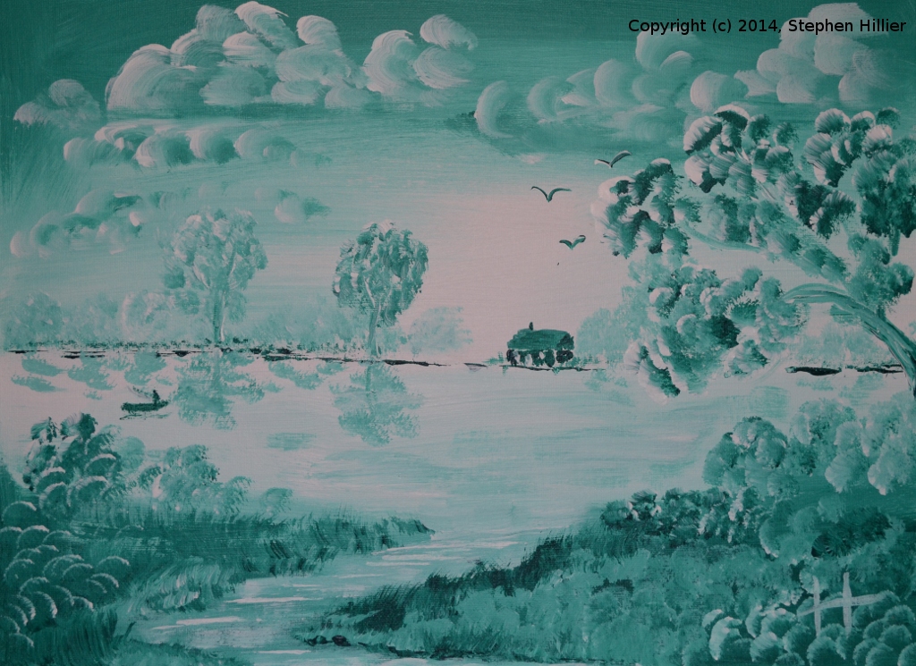
 On the left – “Green River”. Acrylic on canvas board. White and Phthalo Green (Winsor & Newton). Again some recession in the far bank. The cottage is probably a bit close to the river.
On the right – “Purple Haze”. Acrylic on canvass board. White and Ultramarine Violet. Now this is really impressive in the flesh. Very luminescent. I really like this one.
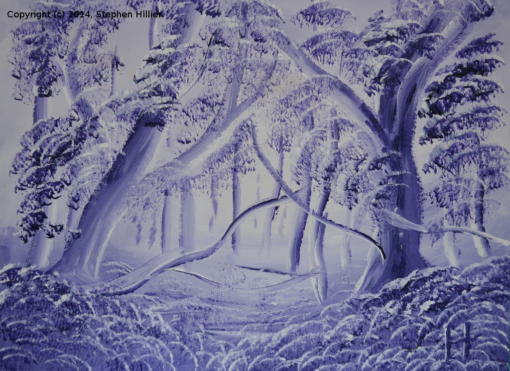
 On the left – “Paint it Black”. Acrylic on canvas board. White and Mars Black. Disappointingly very little contrast. It is the woodland scene again and there is an impression of light coming through the tress. It almost got painted over!
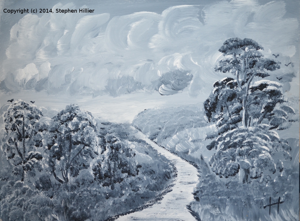
On the right – “Blue turns to Grey”. Acrylic on canvas board. White and Paynes Grey. Better contrast than when using the black paint. I tried to get a more English feel to this one by choosing a different tree style.-
Ok for those who have stayed the course, the explanation. The picture titles are also the titles of songs as follows:-
‘How blue can you get’. A BB King song suited to the strong blues from the ultramarine blue.
‘Cherry Red’. A John Hiatt song redolent in the colour of the picture.
‘Mountain High’. Actually shortened from ‘River Deep Mountain High’ made famous by Ike & Tina Turner. The picture features several layers of mountains.
‘Reflections’. A song by Diana Ross as well as a different version by Misterwives. The picture relies on the reflections of the trees in the water.
‘Green River’. A John Fogerty song made famous by Credence Clearwater Revival. The relation to the picture is obvious.
‘Purple Haze’. Jimi Hendrix of course. Had to be with ultramarine violet!
‘Paint it Black’. Who else but the Rolling Stones. What else when painting in black and white in this theme!
‘Blue turns to Grey’. An obscure track by the Rolling Stones from 1965. The painting reference less clear but Paynes Grey is a mixture of ultramarine blue and black which in this case turns to grey.


Non themed paintings

 I have been playing with making paints. Having used tinted charcoal I decided I did not like the fact that they are in pencil form. I find it a bit restrictive. so…
On the left is an imaginary scene using the blue that comes in the AV pearlescent acrylic inks. I was just playing to get the feel of the medium.
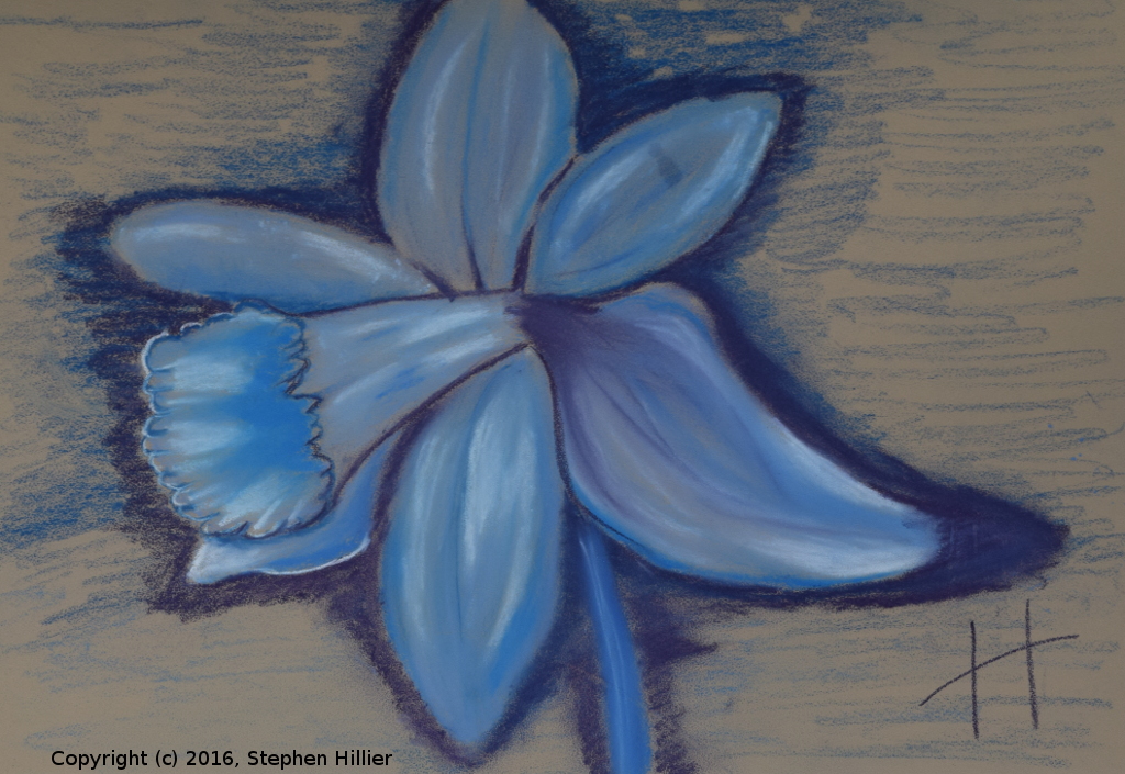
On the right is a picture I did having made some tinted graphite. This particular tint is with ultramarine blue. If you look you can see where the graphite is not quite miscible in water and has pooled in some locations. It is an interesting effect. See the photo I used for the painting here. Having made the paint it was applied as if it were water colour. We had a tutorial on daffodils. Why? What fun is there in painting daffodils. I went along but I really did not know what I was going to do. I certainly did not want to paint a whole lot of daffodils on the roadside, or by a lake. I was not interested in trying to do a flower painting. What can be more boring than painting daffodils.
Then it struck me. Here is the result. A blue daffodil.
Painted using Derwent pastel pencils and then only the blues from my collection – P320. P330, 328, P390, 358. Painted on Mi Tientes Touch pastel paper. The background was deliberately left unpainted except for the fringe around the flower itself. The result is interesting. I don’t expect to see many other daffodils this colour!