I forget where I first found the idea of using just Indigo and Gamboge to paint with. October 2016, I have just located the source of this idea – a small wooden colour box of 12 colours produced by Reeves & Son which I inherited with my father’s effects. Some of the colours look unused – there some be some historical value in this!
I used a small A5 size piece of paper and mixed a range of greens in watercolour. I was then encouraged to experiiment and chose the Dob Park Bridge as my first subject.
This page is dedicated to other paintings inspired by the use of these two colours.
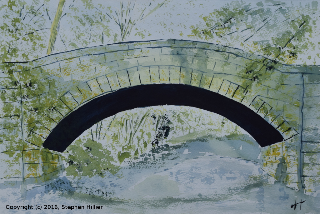
 This painting of Dob Park Bridge (found on the internet) was done on Grey 300gsm Bockingford using ONLY Indigo and Gamboge from the Rembrandt range of Artists Water Colour.
I chose grey Bockingford paper to help give some background colour for the stonework of the bridge. Juxtaposing contrasting colours helps achieve the right effect, for example the bridge itself is light wash of Indigo whilst the underarch is just a stronger mix of the indigo, the tree trunks being light and dark alongside each other.
As an exercise in tonal ranges the importance of juxtaposing light and dark cannot be emphasised enough.

I was preparing to give a tutorial on this subject, really under a sub heading of painting with a limited palette. I did some internet research and found maybe a dozen pictures of bridges set in woodland surroundings.
The reason for this choice is two fold. In any woodland scene there are a range of greens present and this helps bring out the ability to mix a complete of greens using just these two paints. The choice of a bridge with a strong underarch is also deliberate in that it allows the painter to use varying amounts of the same colour to get different effects. The colour of the underarch maybe the same as the parapet and abutments, the same colour but just more of it under the arch.
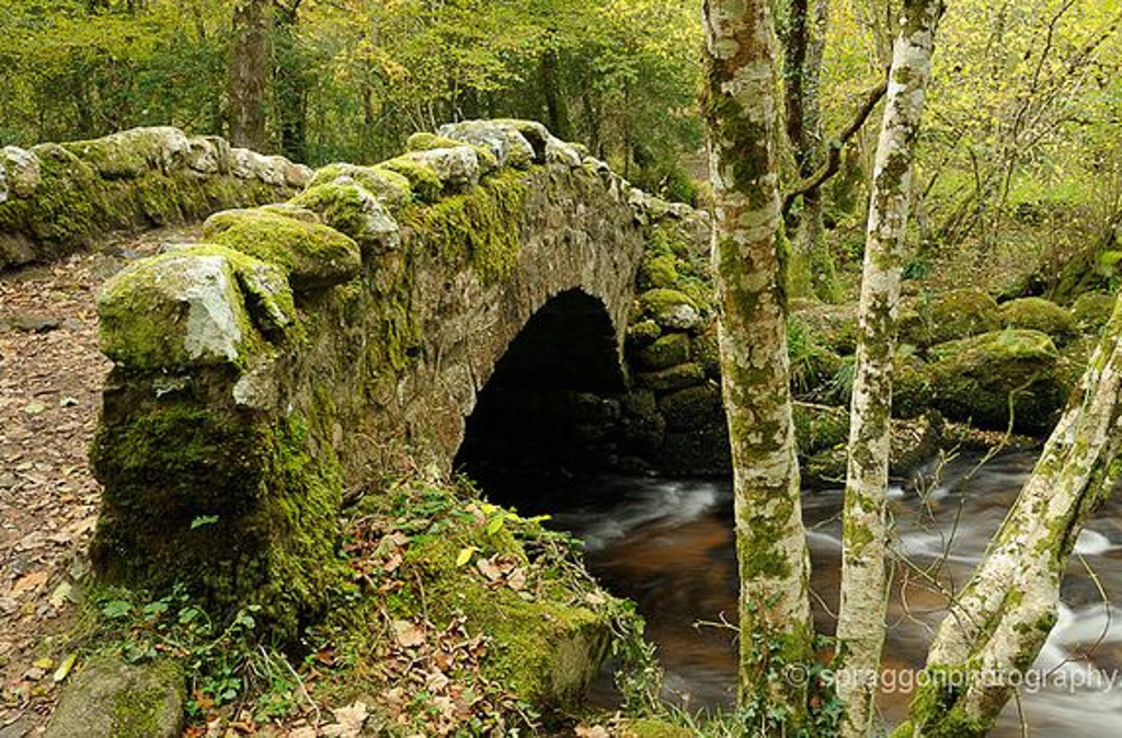
 This picture of the woodland bridge over the Little Sewickley Creek in Pensylvania is the sort of picture I am looking for students to find. A range of greens, a dark under arch with a light grey parapet, trees both behind, under and in front of the structure.
In my painting the courses between the stones are too regular and would perhaps have been better painted wet into wet to get some break up of the regularity.
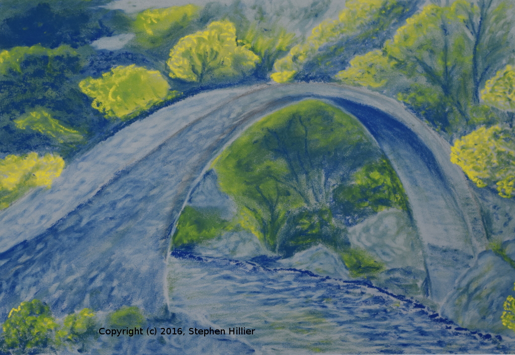
Painted in Royal Talens Rembrandt artists watercolour on 425 gsm extra rough white Bockingford paper. No please don’t call me a liar for this picture. I know it isn’t Indigo and Gamboge. I could not find a pastel maker who names their pastels in this way but to follow the same principles I made myself use only two pastels.
The yellow is Sennelier No 097 and the blue is Unison BV18. The paper is Mi Tientes Touch grey paper. Again the bridge in a woodland setting, trees behind, under and in front.
On the bridge itself and in the water beneath a lot of the there was a lot of lifting off. The rock features were painted in, a stiff hog brush used to smooth and then some lifting off with the putty rubber. A lot of blending with finger and paper stump on the woodland elements.
If this page gets a bit weird it is because I am listening to Pink Floyd – A momentary lapse of reason!
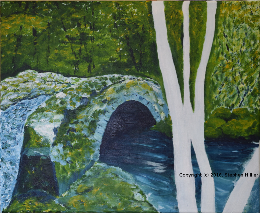
An acrylic painting of a bridge over the River Bovey in Hisley Wood, Dartmoor

 Searching the internet for ideas to show off this colour combination once again bridges come to mind. This one was found courtesy of Spraggon Photography. This work was also one long time in creation – possibly 10 – 12 hours – almost a lifetime in my terms. Also difficult to find was acrylic paint in these two colours. Ultimately tracked down these Old Holland paints.
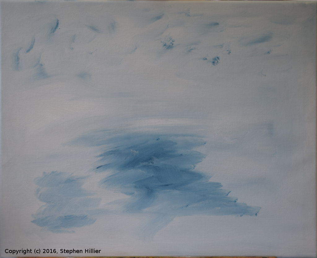
 On the left my working palette. I roughly mix the colours and do a final mix on the canvass. Notice the white at the bottom of the picture and some gloss medium at the top to help with the paint. This image does show on the palette the range of greens that you can get with two pigments.
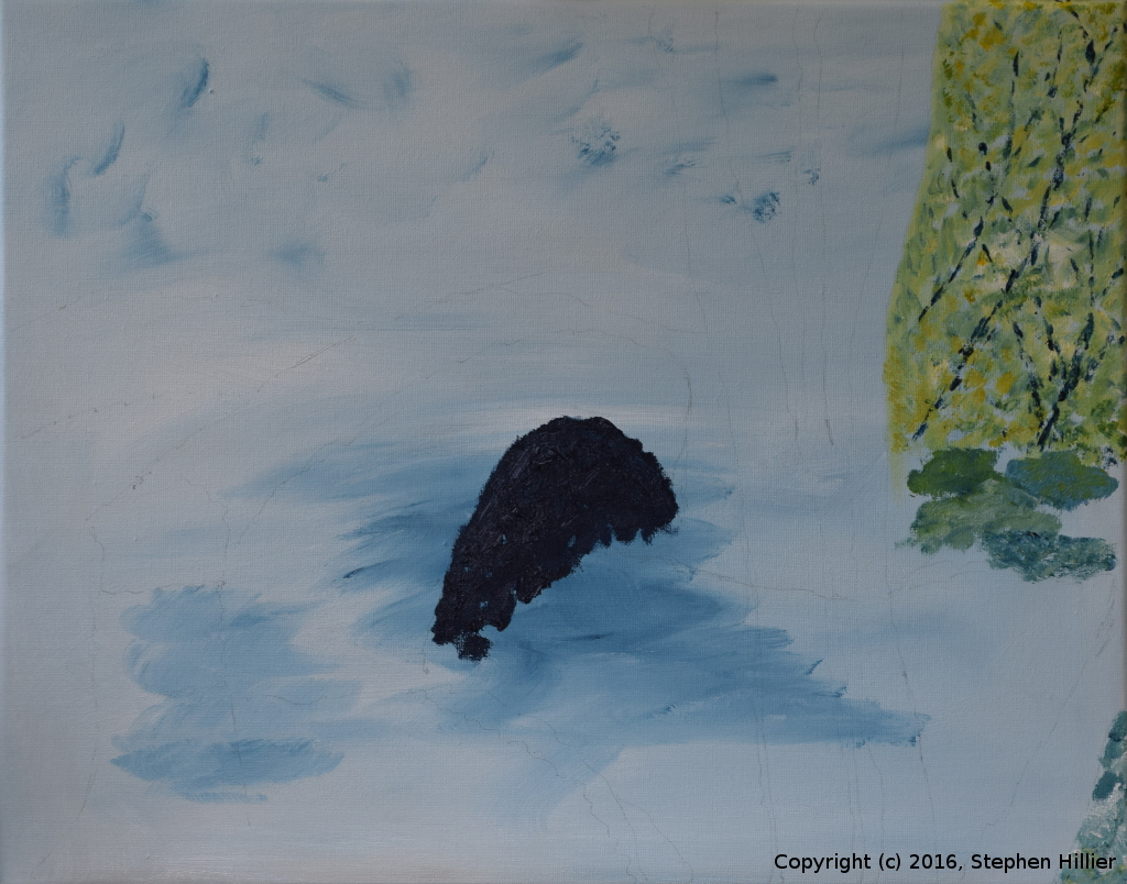
On the right the first task was to make sure the canvas was covered in white. I really wanted to get to the same sort of situation as I would have in water colour and get the canvas threads covered. I mixed a little of the indigo in with the white around the edges and under where the bridge would be.
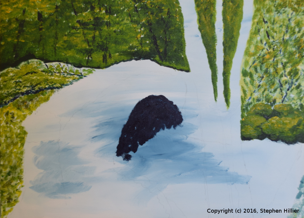
 The under arch of the bridge followed so that there was some placement in the picture about which everything can take place. Some of the woodland in the top corner was added and this was the end of one session.
The next session started with adding the woodland background in the rest of the picture. This woodland worked better than the earlier woodland which then had a later rework. The bridge deck was also painted but does not show the flatness required.
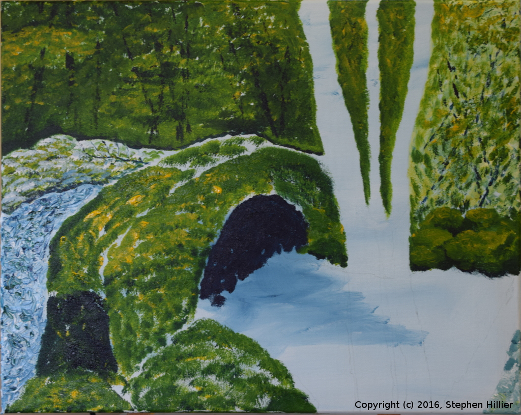
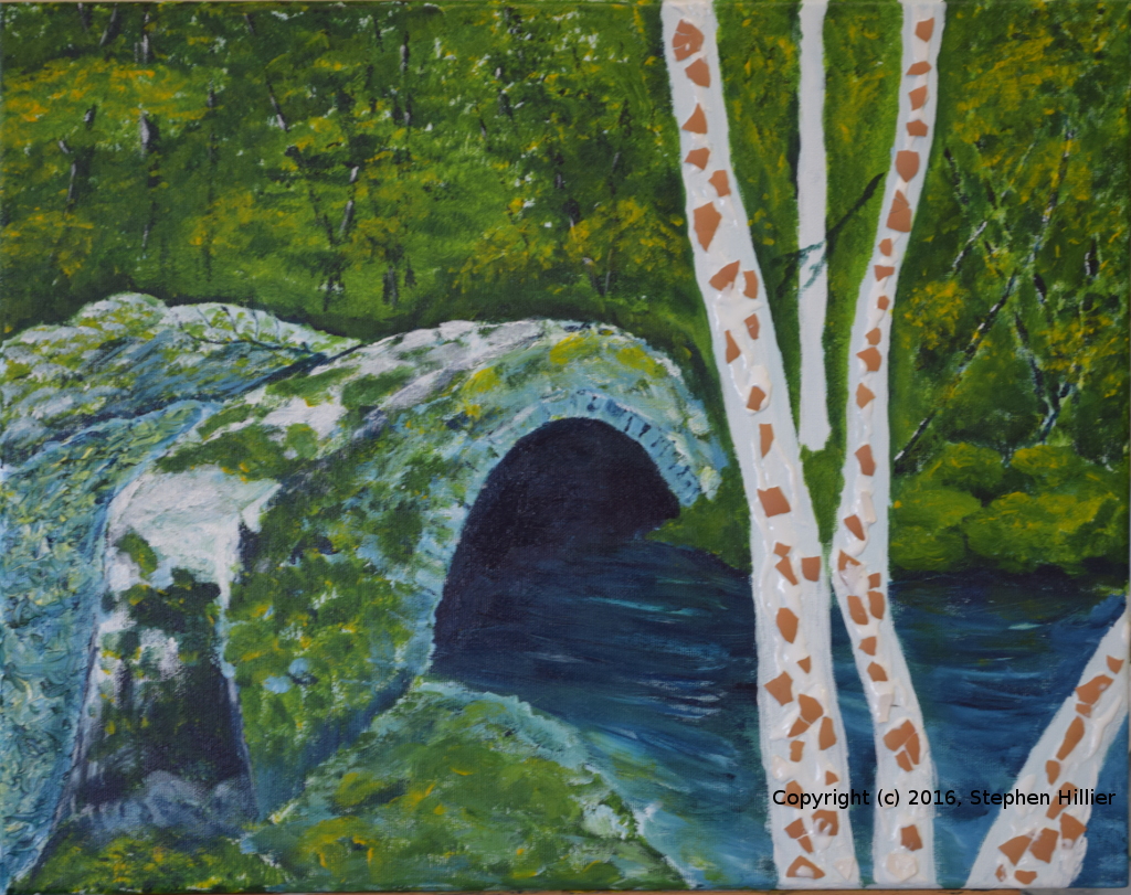
 The next work was fill in the side of the bridge and give some definition to the river.
On the left the bridge base colour is added. It will be lightened later on but it now gives shape to the bridge and the back in the foreground. Then the water was added. It has to look as if it is flowing and it does seem to indicate a slow flowing river.
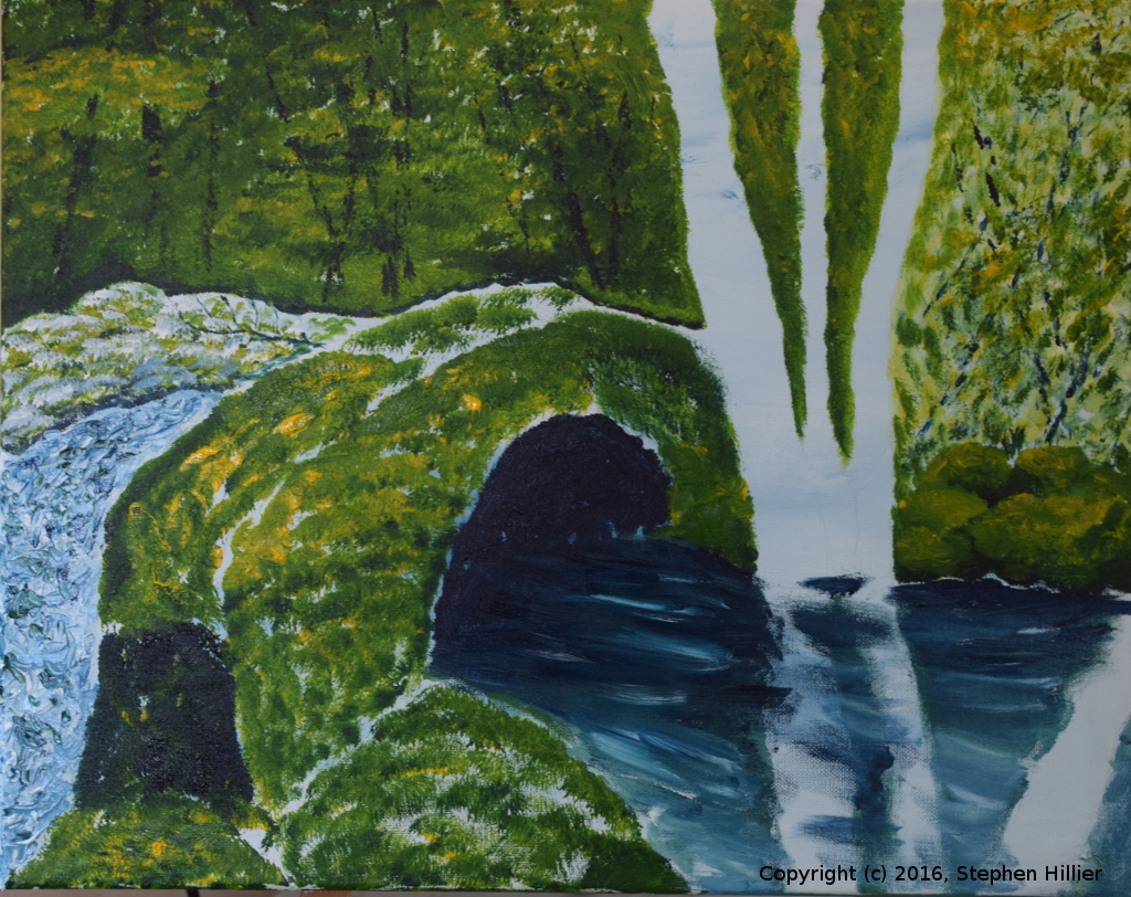
 On the left the bridge is lightened. I have to admit that here I used some white to take back some of the colour. I still don’t think that in this instance that that action compromises the exercise.
On the right there is a little more work on the bridge and the woodland in the top right of the picture is improved by toning it to match the the woodland background. The rocks of the far bank are elaborated.
 On the left the trees were sculptured using eggshell washed and crushed. It was affixed using waterproof PVA woodworking glue. A few highlights were added to the woodland background. This was largely done by adding pure gamboge loaded at the tips of a large round brush, bent by side pressure to give a sort of bow shape.
On the right the finished picture. Once the glue had set the tree trunks were painted in white and then blotches of colour added to give the appearance of lichen.


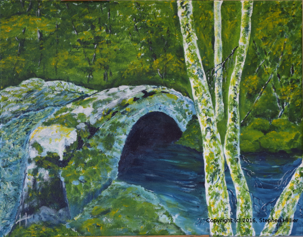
Does it work. I will leave you to be the judge of that. The character of the painting is very different to its watercolour cousins. The yellow brighter, the blue stronger, the technique slightly different, the use of white some might say is cheating but overall I am relatively pleased with the result. Had I given myself the option of using some earth colours I might have been able to get a better definition of the bridge deck. What you can take from this is that you can make a picture from these two colour which if reasonably realistic. Maybe your will take some inspiration from my meagre efforts.