I have been intrigued with lino printing for a number of years, it has been around me ever since I was a little guy. Over the years I have tried and what I have made has resulted in frustration, appalling results and when you see the quality of the work on this page perhaps you will understand why. I was so frustrated with this that on one occasion I gave away all my equipment with a view of never doing any more of it. It was only when in later years I found amongst my father’s effects his set of lino printing tools and some examples of his work, so I thought maybe I should have another go. On this page you may see what can be achieved by this art form and you may even be inspired as I have been on and off over many years.
I do not have any commentary to accompany some of these works but where I have some knowledge I have shared it.


 Just to give some idea of scale the ‘Welcome Inn’ is 4 inches by 5.5 inches (100 x 145mm) excluding the border.
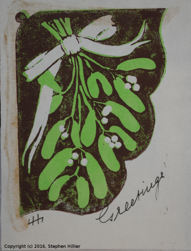
 Both of these were used on Christmas cards at some time. The wolves on the right I remember vividly and I still have the block that produced this card. At one time my father had a small Adana printing machine and this card from the wolves I am sure was printed on that machine. The nativity scene on the left I have no strong recollection of but the subject itself indicated that it must have been used for a card.
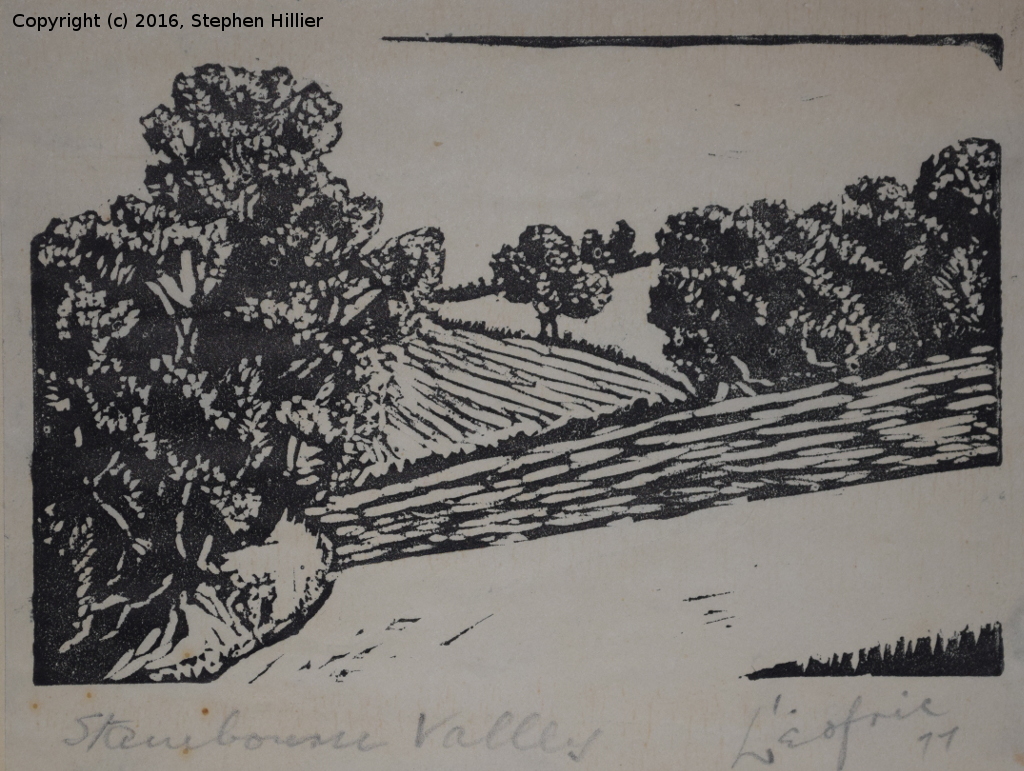
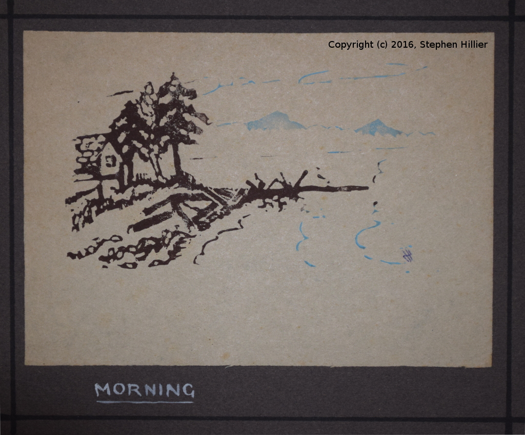
 After retirement the old boy produced a lot more art work. When they moved to Stambourne in North Essex in the mid 1970s a lot of small pieces of art were done of the area around the village. The lino print on the left is just one example of the sort of work my father did. The image on the right, which I think may have been used on a family Christmas card. It is a print taken from a drawing he did on a visit to my sister in Vancouver. I have always called it Vancouver Island but I note this print it titled ‘Morning’. The annotation on the print says is was done from a single cut which means that he must have inked the lino differentially to separate the blue from the black.
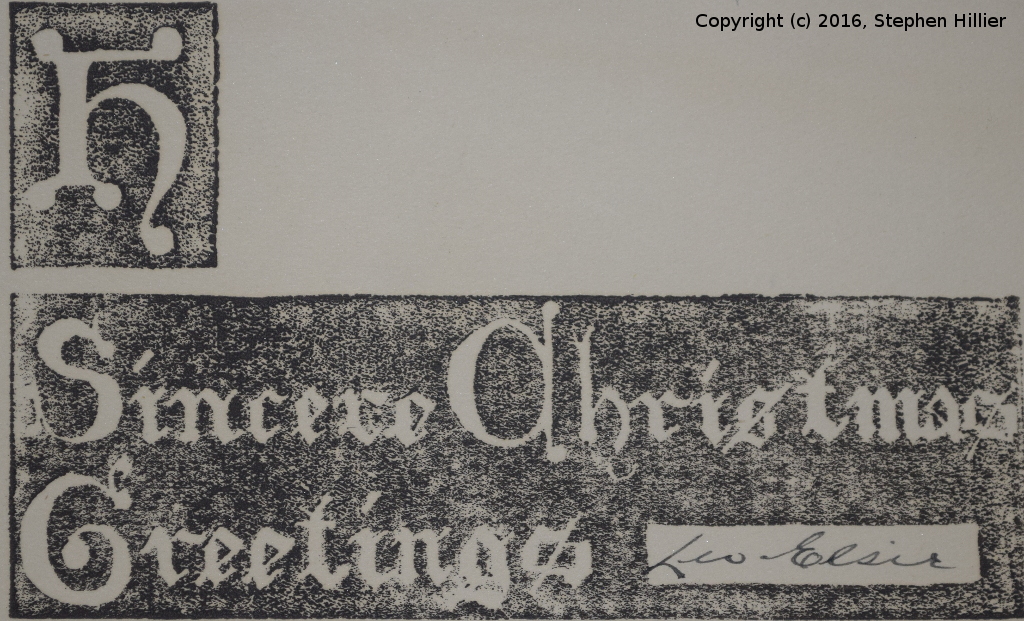
 I have been told that lettering in lino is extremely difficult. If that is the case then the work of the left is some achievement! I can appreciate the quality of this work but I have no inclination to emulate it.
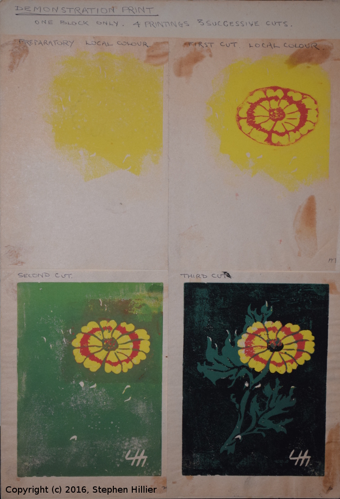
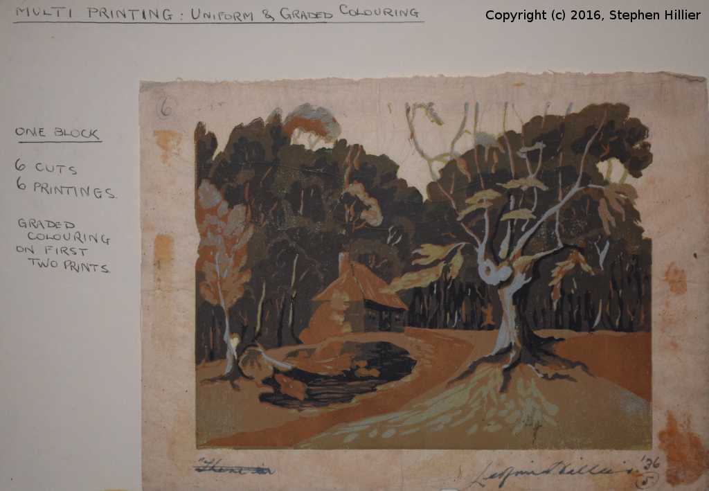
On the right is a display card that the old man used when, living in Clare, Suffolk, he joined an art group. I have no idea of when these were printed but I suspect it may have been in his early life. It shows the reduction method off to a tee. It also once again demonstrates how he used local colour to print just one area of the image whilst the lino was still intact for later cutting. As the narrative says this was one block and three cuts. Now, to my mind, la pièce de résistance. Printed in 1936 when the old man was a mere stripling of 25 years of age. I have left his narrative on the image so that you understand that it is not some weird imagining of mine that this image was produced from a single block which was cut 6 times to produce this picture. I sit and wonder at the vision that was in his mind when he was deciding how much lino to cut out at each stage. I think that the light blue was the last colour used and look how there are odd bits of this in the trees. Even the chimney has a small bit of blue where the sun catches it. I still cannot get my head round it. I know this is an early work because he signed his name in full rather than used the monogram adopted later and which you can see in other prints on this page. Later, as can be seen in the Vancouver print, even his monogram got reversed. I do have one picture there he signed in L Hillier but is written backwards. This print is 8inches by 6 (200 x 150mm)
When I can produce something of this quality in lino prints I think I might say I have started to get hold of the concept of working in lino.